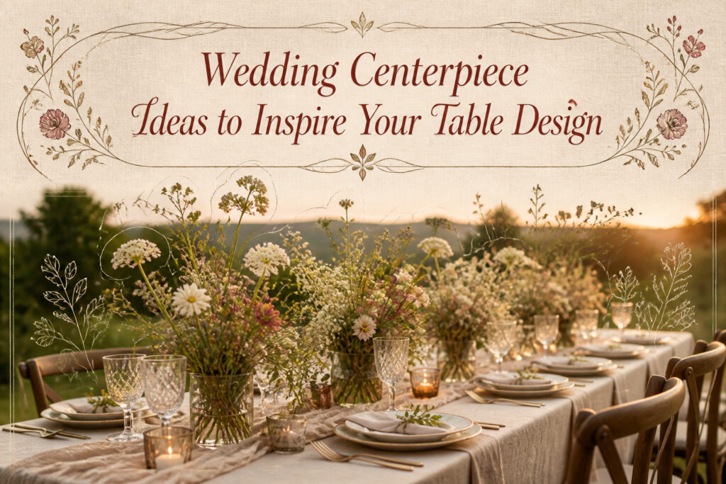
The right wedding centerpiece depends on your table shape more than your Pinterest board. A sculptural lamp with wild florals that looks effortless on a long rectangle will guard one side of a round table like a sentry, leaving half your guests with nothing to see. The same geometry rule governs nearly every option here, from rows of roses that need length to repeat against to bud-vase clusters that only work when spaced with breathing room. What unites all thirty-one ideas is that each one was tested at a real reception, and each one has a condition that breaks it.
1. Table Lamps and Wild Florals

A sculptural table lamp with a clear glass shade can anchor a centerpiece while wild florals spill from its base or gather beside it in loose, unstructured shapes. The contrast reads immediately: hard architecture against soft, opened-up blooms and dynamic greenery that looks like it was gathered rather than arranged. At a winery wedding in Santa Ynez, brides leaned into that tension, pairing neutral white and red petals with lamps that made the long tables feel like a chic dinner party rather than a banquet hall.
This layout works best on rectangular tables where the lamp’s height draws the eye across the length without blocking conversation the way a tall floral dome would. Round tables fight the effect; the lamp ends up guarding one side of the circle like a sentry while guests on the other half lose the visual entirely. The wild florals need breathing room too, so skip this if your venue squeezes ten seats where eight belong.

Effortless Portability with Wireless Design: embrace the convenience of a portable wireless design that eliminates cable clutter and enhances your space; This lamp's moderate...
2. Vintage Lace and White Flowers

Aged lace brings its own history to a table, and that texture does the heavy lifting when flowers stay quiet. I like white blooms against cream or tea-stained lace runners: the fabric catches shadows the petals won’t, so the arrangement reads as depth rather than flat color. Doilies under low bowls work the same way, or strips of lace wrapped around glass cylinders with the stems visible through.
The pairing shifts hard across a reception timeline. Afternoon light, especially near windows, turns ivory lace almost gold and can make white flowers look green-tinted by comparison. By evening, under warm bulbs or candles, that same lace deepens to something closer to butter, and the blooms finally catch up, glowing instead of competing. If the venue runs both settings, test the lace at the actual hour; a runner that looks refined at 4 PM can turn muddy once the sun drops.
Clean stems matter here. Lace already carries pattern and age; adding busy foliage or variegated petals fights against it. I stick to massed hydrangea, ranunculus, or garden roses, all one tone, letting the fabric do the talking.

High Quality: The table runner is 14 x 120 inch and made of high-quality lace fabric, which is comfortable, soft and sturdy.
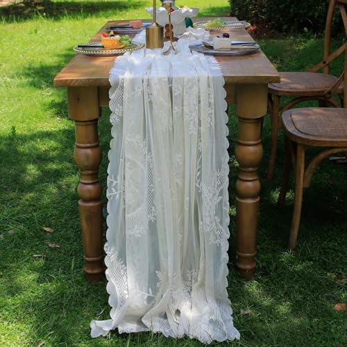
Material: Our table runner is made of high polyester lace fabic, soft touch, durable and reusable. Can use as table runner, wedding arch or any other places you would like to decor.
3. Neutral Blooms and Colorful Candelabras

The eye needs somewhere to land on a crowded table, and color belongs on the vertical element, not scattered across every petal. Cream, blush, or white blooms sit back and let painted or gilded candelabras do the work: deep blue, emerald, coral, oxblood. I learned this watching a planner pair pale ranunculus with a pair of matte navy candelabras at a winter wedding. The flowers read as texture; the candlesticks read as the moment.
Gilding catches candlelight differently than gilt paint does. Real gold leaf on brass turns liquid after dark, while a flat coral enamel stays true to its color. Either way, the height draws the gaze upward and gives guests at opposite ends of a long table something to share between them.
The restraint matters. Three stems of a single pale variety per base is usually enough; more competes with the stemware. What convinced me, looking through dozens of these setups, was how much air the table kept. No one leaned around a hedge to talk. The color lived above the conversation, not in it.
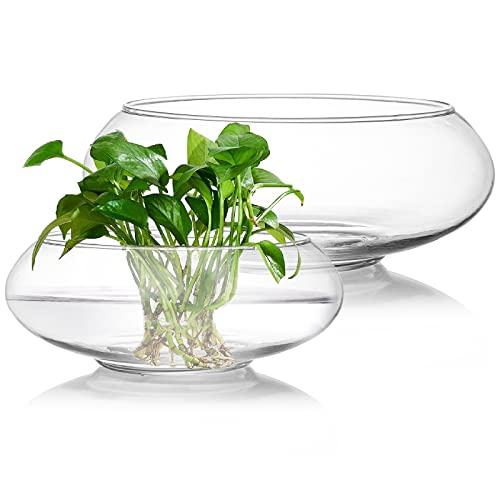
ZENFUN set of 2 glass vase bowl comes with wide mouth, oval opening in two different sizes: one measures 6'' top opening diameter, 7.8'' external width and 3'' height; the other is 8'' top opening diameter, 9.5'' external width and 3.8'' height

【Realism with Charred-Edge Roses】Our artificial rose boasts meticulously crafted flowers, each petal edge gently toasted for an unmatched realistic touch. Unlike conventional faux flowers, our unique burning technique eliminates any trace of fabric fray, makes silk harder and can better maintain the shape of the flowers, not paper flowers. Perfect for long-lasting home décor without the hassle of wilting blooms.

VINTAGE WHITE PEDESTAL VASES - AZXTOPSEZ white compote bowl vase blends classic design with modern luxury, featuring minimalist lines that are arranged neatly, while the white finish adds a hint of delicacy and charm. Whether it's for a special event or home decor, this white urn vase is sure to catch the eye and become a timeless addition, witness all unforgettable moments with you.
4. Spheres of Candlelight

Round glass orbs clustered at varying heights turn a table surface into a field of repeated circles, each sphere catching and multiplying the flame inside it. Leave at least two inches of air between the glass and the wick so the enclosure does not overheat and crack, and the geometry works best when you mix three sizes rather than two, since three points make a cluster look intentional rather than accidental. The reflection across polished tableware or a glossy linen creates a second layer of circles below the real ones, which is the effect most couples notice first when the room lights drop. Open flame inside glass needs tending: the orb traps heat, so the wax softens faster than it would in open air, and a wick that drifts off-center can scorch the inner wall in under an hour. I have seen setups where the florist nested the orbs in a bed of moss to keep them from rolling, which solves the physics but kills the reflection, so weighted glass bases or a thin ring of florist adhesive work better if the table will be bumped during service. Globe candles with their own integral glass are safer than votives dropped into separate spheres, since one piece leaves no gap for the flame to reach.

Lifelike Silk Ranunculus: Crafted from premium silk material, these flowers feature intricate petals and soft natural gradients, mimicking the delicate texture and depth of fresh ranunculus to bring a sophisticated, lifelike touch to any setting
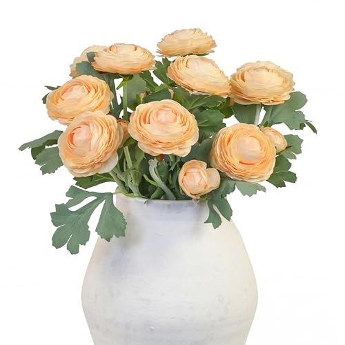
[FLOWER] Blooming flower and buds are made of high quality faux silk. The ranunculus petal is excellent hand feeling and elasticity. You can feel it’s soft and relastic like real ranunculus flowers

Product Content: the package includes 6 gold cylinder vases, 6 artificial peonies, and 18 artificial babysbreath stems; This complete set offers a harmonious mix of gold, white, and vibrant peony colors, creating a stunning visual impact with minimal effort
5. Pastel Prints and Florals

Patterned linens in soft pastels, chintz, or ditsy florals can anchor a table beautifully, but they compete fast with anything else busy on the surface. Bold print wants simple flowers; intricate blooms need a near-solid ground. I learned this calibration the hard way at a spring wedding where sage-green chintz runners met blush peonies head on. Each element was lovely alone. Together they flattened into visual noise, neither the print nor the flowers winning attention because both demanded it. The fix would have cost nothing, just pulling the linen to a pale sage twill and letting those peonies carry the whole design. When you want pattern, commit to it, then strip the florals down to a single stem variety or a quiet green filler. The restraint reads as confidence, and the table breathes.

❤ Delicate Design: You will receive 36 adorable glass bud vases. The design of relief on the glass surface looks exquisite, beautiful, luxurious and unique. The mouth of each vase is large enough to accommodate two or three mini roses and filler flower.

🌴【VINTAGE DESIGN】You get 32 glass bud vase, Each small vase is adorned with an etched pattern that further enhances the appeal. They are vintage yet elegant and can be used for any occasion, from elegant to simple and casual. They will make beautiful decorations for a windowsill, dining table or wedding table.

Premium Clear Glass: Made from high-quality glass with exceptional light transmission. These clear vases showcase your flowers beautifully—perfect for everyday display or special occasions.
6. Melange of Wildflowers

A handful of Queen Anne’s lace drooping beside a stem of black-eyed Susan says "just gathered" in a way no symmetrical dome ever will. The wildflower look lives in the accidents: a poppy three inches taller than its neighbor, clover threading through grass blades, colors that clash instead of coordinate. Florists can build this, but the trick is resisting the urge to fix every stem. The best versions keep some stems stripped of leaves halfway up and others left bushy, so the arrangement reads as found rather than composed.
Genuinely foraged centerpieces carry real limits. June gives you lupine, oxalis, and early daisies in most of the country; by September you’re working with goldenrod, asters, and the last tough stems of yarrow. What reads as effortless in early summer turns sparse later unless you supplement with garden cuts or accept a moodier palette. I’ve seen couples try to force a June look into October by shipping in out-of-season blooms, and the result always looks dressed up for the wrong party.

Portable Cordless and Battery Rechargeable: this built-in 1800mAh rechargeable powered battery lamp can be applied for 15 hours ( minimum brightness) ( can also be adopted while charging); The size is about 4.3 x 11.8 inches/ 11 x 30 cm; For battery protection, please use a standard 5V/ 2A or lower charger; Fast chargers are not recommended as they may affect battery lifespan

Portable Cordless and Battery Rechargeable: this built-in 1800mAh rechargeable powered battery lamp can be applied for 15 hours ( minimum brightness) ( can also be adopted while charging); The size is about 4.3 x 11.8 inches/ 11 x 30 cm; For battery protection, please use a standard 5V/ 2A or lower charger; Fast chargers are not recommended as they may affect battery lifespan

High Quality: Made of high quality zinc alloy, durable, anti-oxidation, no rust, never fade, durable
7. Bud Vases and Blooms

Scattering a cluster of small vessels across the table, each cradling one or two stems, changes the arithmetic of the whole room. Six to ten bud vases per eight-top keeps the eye moving without blocking sightlines, and the gaps between them leave pockets where guests can lean in and actually talk. A single large arrangement demands a bigger budget for impact and often sits like a wall of flowers; the same total stem count split across ten tiny bottles reads as abundant for about half the spend, since you’re buying fewer filler greens and no structural armature. The trick is spacing: too tight and the cluster reads as one lump anyway, too loose and the table looks unfinished. I learned that one the hard way at a rehearsal dinner where five vases looked like I’d forgotten the rest. Seven, set in a loose crescent with breathing room, would have saved the whole look.

White Lace Table Runner: you will get 12 pack 30 x 120 inches vintage rustic wedding lace table runners, fiting most rectangular or round dining tables, which will create a elegant atmosphere; These embroidered floral boho table runners enough to meet your everyday kitchen decorating needs; You can also share them with others

Versatile Black Lace Table Runner: Perfect for weddings, bridal showers, this 14x118-inch runner fits various table sizes and event settings effortlessly.

Ample Quantity For Event Decor: this white lace table runners set includes 12 identical lace table runners, providing sufficient coverage for large gatherings or multiple tables. ideal for weddings, parties, or regular home use, ensuring consistent styling without needing additional purchases.
8. Something Blue
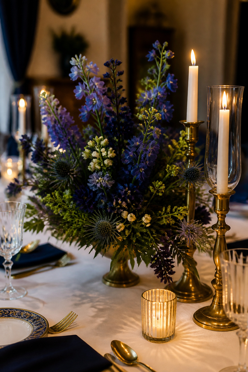
Blue in a centerpiece can anchor the whole table or sit there like a mistake nobody wants to mention. The difference is usually how the blue got there. Navy reads intentional; periwinkle reads like someone forgot to check the dye lot.
I once watched a bride ask for navy thistle and delphinium, something moody against brass candlesticks, and the florist delivered clusters that leaned cornflower in the showroom light. By reception hour, under warm bulbs, they looked like a baby shower had wandered into an otherwise formal room. She smiled for photos and later told me the color was the one thing she wished she could do over.
Hydrangea carries the same risk. The same bush can shift from slate to powder depending on soil chemistry, so "blue hydrangea" in a contract guarantees nothing. If you want the something old/new/borrowed/blue tradition to show up in the flowers, specify the cultivar, ask to see the actual stems a week out, or build in painted elements, glass, or ribbon that you control yourself.
Painted vases or blue taper candles give you the token without the lottery of living pigment. They also let you calibrate: a single navy candle in a cluster of ivory reads as thematic continuity, three competing shades of blue read as indecision.

Elegant Glass Bowl Set – Includes two round vases (7.5” & 9.5”) made from durable, high-quality clear glass with a smooth finish—perfect for floral arrangements, terrariums, or home accents.

YOUEON cylinder glass vase measures 4 inches height by 8 Inches width. Neither too big nor too small. Appropriate size is right for you to work your magic on it. The cylinder vase weighs about 2.5 pounds, please confirm the size before purchasing

The design bowls are mainly used as flower containers for flower arrangements. Can be used for wedding, home, office, party, conference hall, holiday decorating, etc.
9. Textural Tablescape

Matte surfaces swallow light whole, and that is the problem. Unglazed ceramic, raw linen, rough bark, unfinished stone: each one drinks up a camera flash and gives back almost nothing, turning into flat brown shapes in the final image. The texture your fingers feel disappears.
I learned this at a vow renewal where the couple had set marble slabs from their own kitchen onto the tables, paired with stoneware vessels and loose greenery. The stone looked like pale, dead weight in the early test shots. The flowers, which had been an afterthought, were the only things reflecting light back to the lens. The marble that anchored the design was the first element to vanish.
The fix is not more flash. It is softer light from farther out, or none at all. Candlelight works, though it pulls the table toward warmth you may not want. Daylight through tall windows is better when you can get it. What you cannot do is treat a textural tablescape the way you would a glossy one and expect the materials to survive the photograph.

Tips: The outer layer of the artificial peonies stem is plastic material, which has plastic taste. Please place loose smell when receiving

【Package Details】:The package includes 18 pieces of mini ranunculus flowers with stems(approx. 11 inches tall). Each piece has four flowers, two blooming flowers(about 1.2 inches wide), and two flower buds(about 0.5 inches wide).Ideal as fillers for bouquets and table centerpieces.
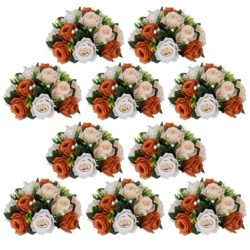
3 Functions In 1: NUPTIO patented artificial flower balls (U.S. Patent No. D935348S) offer three beautiful ways to decorate. 10 ties are included for easy DIY—connect two flower balls to create romantic kissing balls; each half flower ball can be placed directly in a vase or on a table to form a centerpiece for various occasions; they can also be paired with our store’s flower stands for porch decoration. Many more creative possibilities are waiting for you to explore.
10. Pink and Green Pastels

Soft pink roses against varied greens read well across almost every skin tone and lighting condition a reception throws at you. The pink warms faces without competing, while sage foliage or an emerald glass vessel anchors the tone so it never drifts into nursery territory. I have shot this pairing in golden-hour tent light, in hotel ballrooms with overhead spots, and in a barn where the only source was a string of Edison bulbs, and the balance held every time.
The trap is assuming the florist or wholesale order will deliver the exact range you pictured. A 50-stem order labeled Hot Pink & Light Pink Roses arrived for one shoot entirely in one mid-tone pink, and the contrast that makes the palette work simply was not there. The bride had planned to separate the shades herself across twenty tables. We ended up pulling in deeper ranunculus from her bouquet to save the depth, but always confirm your vendor is separating tones before shipping, not after.

20-Piece Small Bud Vase Set: This clear glass bud vase set includes 20 assorted mini vases, ideal for displaying fresh flowers, single stems, dried flowers, wildflowers, or small floral arrangements around the home or event space.

🌷[Glass Bud Vases Set of 24] - The bud vase in bulk come with 2 sets of 12 different shapes and sizes of small glass vases for flowers (please refer to the size chart). They are cute small vases for decor, the collections offer a variety for small arrangements, add an extra pretty cute touch to anywhere, especially for party centerpieces.
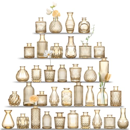
Vintage Design: UPBUD bud pattern vases evoke a nostalgic charm, adding a vintage touch to your living space and enhancing the aesthetic appeal of your home. This collection features 36 glass vases of varying sizes and shapes, effortlessly elevating your table setup to create a truly distinctive ambiance.
11. A Sunset of Roses

Ombre rose arrangements move from deep coral through apricot to pale yellow in a single vase, and the effect depends entirely on timing your blooms. A 50-stem Red Roses bunch and a 50-stem White Roses bunch are the starting point, but the real work happens in the days before the wedding when you force them to open at different rates.
Some varieties shift color dramatically from tight bud to open bloom. A coral rose can read almost burgundy when closed, then warm to salmon as it relaxes. Others hold their hue steady and only lighten in value, which gives a flatter gradient. Ordering two weeks out lets you test the shift by opening stems at room temperature and marking which days hit which tones. The stems that open fastest sit at the pale end of your arrangement; the slow stay deep.
The apricot middle band is where most gradients fail. It is not a color most growers sell straight, so you build it by mixing the coral that has aged three days with the yellow that is still half-closed. The proportion changes by variety, and by temperature in your prep space. I have seen florists throw out two dozen stems to get twelve that bridge the gap cleanly.
12. Tonal Tablescape

A single-color tablescape lives or dies on whether the eye has enough to do. Cream on cream, burgundy on burgundy, slate on slate: the discipline is real, and so is the risk of a flat, muddy result. What saves it is stacking contrasts that have nothing to do with hue. Matte ceramic against glazed glass, velvet ribbon against raw linen, wax bloom against polished metal. The texture has to carry all the weight color usually handles.
Hydrangeas are the workhorse here, specifically the 24-stem bunches that wholesale florists move by the case. One stem fills the space three roses would, and because the florets sit so tight together, you get volume without a color break at the center of the arrangement. At a reception in Portland last fall, the florist ran cream hydrangeas into cream dahlias into cream roses, and the only thing that kept it from reading as a bakery display was the shift from waxy petals to papery ones to the velvet crush of the dahlias. The hydrangeas held the structure; everything else supplied the variation.
The danger is stopping too soon. Two textures in one tone just looks like a mistake. Three starts to read as intention, and four or five is where the table begins to feel designed rather than decorated. The restraint is the point, but restraint without enough material to restrain is just emptiness.
13. Mossy Mélange

Sheet moss, reindeer moss, and sphagnum each handle moisture differently, and that difference decides whether your tables look lush or desiccated by the time guests sit down. At an outdoor wedding in late August, reindeer moss that had been misted that morning dried to something like parchment before cocktail hour ended. The couple had chosen it for its velvety texture against dark wood farm tables, which was the right instinct for the venue, but open-air heat pulls moisture from moss faster than any florist warns.
Woodland venues with steady shade and humidity forgive this choice. Ballroom settings with climate control and no direct sun are nearly as forgiving. Anything in between, a tent in July, a greenhouse in spring, a patio catching western light, demands a different ground cover or a plan to seal the moss with glycerin beforehand. Sphagnum holds water longest because it acts like a sponge, though it can look stringy and wild compared to the neat nap of reindeer moss. Sheet moss lies flattest and shows off flowers that emerge from it as if they grew there, which is the whole point of the look, but it tears easily and needs pinning.
The moisture problem has one practical fix. Soak the moss thoroughly the night before, let it drain, then mist it again two hours before the event starts. Skip this and even indoor moss can crisp under photography lights.
14. Set in Stone

Stone vessels, geode slices, and raw mineral specimens carry a visual heft that glass and ceramic simply cannot match. The cool density of marble or granite against linen reads as permanence, something borrowed from geology rather than a rental warehouse. I have watched couples fall hard for a single travertine bowl or a cluster of quartz points, and the instinct is sound: the material does half the styling work on its own.
Rented tables have load limits, and not every venue floors the same way. A historic ballroom with original joists may cap weight per square foot at a figure that rules out a centerpiece fleet of solid stone. I know a pair who bought out a quarry’s offcuts for thirty tables, only to learn the building’s engineer would not sign off. The stone sat in a garage while they scrambled for plan B. The lesson cost them the purchase price plus rush shipping on replacements.
If the venue clears it, distribute the mass: one substantial anchor per table with lighter elements radiating out. If the venue does not, resin casts and stone-look plaster give the same silhouette at a fraction of the load. The eye notices texture before it notices authenticity; the camera almost never knows the difference.
15. Bursts of Blooms

Thin stems let flowers do things thicker ones cannot. A 120-stem ranunculus arrangement spreads outward like a firework burst, each stem angling past the rim of its container rather than standing upright in a tight dome. The weight stays low, so the whole mass hovers above the table without toppling.
That outward reach costs you real estate. A centerpiece that measures eighteen inches across at its widest point needs at least six inches of clearance on every side for plates, glasses, and the elbows of guests who actually want to talk to each other. I learned this the hard way at a spring wedding where the ranunculus spilled so generously that servers had to lift entire arrangements so guests could pass the bread basket. The tables looked lush, but the seating felt pinched.
Space calculations matter more with this shape than with tall vertical pieces, which leave the table surface alone. Map your place settings on paper before committing to the final stem count.
16. All About Orange

Orange at a wedding table either glows or it shouts, and the line between the two is thinner than most couples expect. Rust and tangerine sit at opposite ends of the same family, but both read as energy made visible, the color of late afternoon light when it finally breaks through cloud cover. That warmth is what draws people in, and what can tip into something almost aggressive if the saturation pushes too hard against white linens or silver flatware.
The couple who committed to it fully, no blush or cream to soften the blow, chose a late November afternoon when the sky had gone flat gray and the light was already leaving by four o’clock. Their tables carried persimmons, ranunculus in that true safety-cone shade, and taper candles whose wax matched the fruit exactly. Against the window light, the color didn’t fight the room; it rebuilt it. Guests kept touching the table runners, running fingers across linen dyed in a gradient from pale apricot to something near terracotta at the center.
The risk with orange is that it reads as decoration rather than design, a pop of color where what you want is a point of view. The fix is commitment: let it own the table from edge to edge, let the eye travel and find the same tone repeating in ceramic, in foliage, in the flame itself. Done this way, orange doesn’t decorate a November afternoon. It rescues one.
17. Citrus Style

Lemons, oranges, grapefruit, kumquats. Whole fruits stacked in a bowl or sliced thin and worked into the arrangement itself. The look is bright, graphic, and costs a fraction of a full floral build.
The shelf life is where it gets interesting. Fruit outlasts most cut flowers by days, but it also softens, molds, and in July heat can draw fruit flies fast. One outdoor summer wedding I heard about ended up with a gnat situation the caterer had to sweep between courses. Keep citrus centerpieces indoors, or skip them entirely for August receptions.
Color clash is the other pitfall. A florist once showed me her order sheet for a lemon-yellow wedding: 40-stem calla lilies paired with 20-stem hydrangea, both in competing yellows against actual lemons. The flowers looked muddy, the fruit looked brown by comparison. Either let the citrus carry the color alone, or pair it with something neutral like white roses or deep green foliage. The stemmed-rose trick, stuck straight into a whole orange, works because the contrast is deliberate. Two yellows fighting each other never is.
18. Rows of Roses

A row of roses reads as architecture, not bouquet. Fifty white roses lined stem-to-stem in a low rectangle turn the table itself into a grid, and that discipline is what makes the idea sharp. Cluster those same fifty stems and you get softness, volume, romance, but you lose the line.
The shape answers to the table shape. Long rectangular tables give the row somewhere to go; the repetition pulls the eye down the full six or eight feet and turns the centerpiece into a spine for the place settings. Set that same rigid line on a round table and it looks stranded, a ruler laid across a plate. Rounds want centrifugal shapes, something that fills outward. Rows want length to repeat against.
What convinced me, looking at the two arrangements side by side, was how the clustered version asked to be viewed from above, the way a bride might look down while passing. The row asks to be viewed from the side, the way guests actually sit. For rectangular tables, choose the formation that works in profile, not plan.
19. Sage and Soft Florals

Pale green-gray foliage reads as a near-neutral in photographs, which is why sage-heavy centerpieces need something that breaks the tone. I learned this the hard way at a spring wedding where the tables, shot from above, looked like pools of gray-green water with no entry point for the eye. The fix was already in the bouquet: Baby’s Breath in volume, roughly a hundred stems tucked low around structured sage, gives the camera something to land on. The tiny white blooms catch light differently than the matte leaves, creating depth without introducing a competing color. Muted pink or cream roses held higher complete the palette, though I would keep them sparse. Too many warm flowers and the arrangement becomes another pastel centerpiece; too few, and the whole table washes out under venue lighting that leans cool. The balance that has worked for me is about three focal blooms per foot of table length, with the Baby’s Breath doing the quiet work of separation.
20. Warmed Up Whites

Pure white flowers under reception hall LEDs often read as cold or faintly blue, which is the last tone a warm celebration needs. Shifting the palette toward cream, ivory, or champagne corrects that imbalance without abandoning the clean look entirely. The difference shows up most clearly in photographs, where skin tones stay flattering and the tables keep their glow past sunset.
A continuous ivory runner ties the room together more effectively than individual placemats or scattered petals. The 6′ Wedding Runner 4-pack in ivory ran the length of each table at a spring reception I photographed in Charleston, and the color bridged the gap between the linen and the candlelight. Cream and ivory hold warmth under artificial light in a way pure white cannot, which matters more than most couples realize until they see the proofs.
The trick is committing to the shift across every element: ribbon, taper candles, even the sugar flowers on the cake. Mixed temperatures, a warm bouquet against stark white china, read as a mistake rather than a choice.
21. Wild Greens

A centerpiece built almost entirely from greenery reads as intentional, not like someone forgot the flowers. Eucalyptus, fern, olive branch, and trailing ivy each carry a different mood: silver-dollar eucalyptus catches candlelight, while ivy spills over vessel edges in a way roses simply won’t. The savings run steep enough to notice, since filler greens wholesale for a fraction of what even in-season blooms cost, and a single wholesale bunch of fern often covers a whole table.
The risk is social, not visual. At one spring wedding, the eucalyptus-heavy tables looked lush in photographs, but the scent concentration in a warm tent gave three guests headaches and one a full allergic reaction that sent her outside. That couple had chosen seeded eucalyptus specifically for its fragrance, never considering it would intensify in an enclosed space with eighty people breathing the same air. Fern and olive branch carry almost no scent, which makes them safer bets for tight rooms or guests with sensitivities.
Trailing ivy needs weight in the base or it will slide and unravel across linen during the first hour. A low ceramic bowl with a floral frog works; a tall glass vase does not.
22. Celestial Centerpieces

A fluted votive catching candlelight against a dark linen already reads as stars without needing anything else. The couples who get this right stop there, or add one more element at most: a single long-stemmed bloom, a pressed moon phase at each place setting, a metallic orb tucked into greenery. The ones who push further risk the zodiac-table problem, where half your guests spend ten minutes squinting at their salad plate trying to find Scorpio while the other half never notices you spent money on custom china.
Thematic commitment works best when the metaphor is visual first and literal second. Star maps printed on vellum overlays look elegant until someone has to read actual coordinates by candlelight. Constellation patterns stitched into table runners register as texture and shape; the same pattern repeated on menus, coasters, and favor tags starts to feel like a planetarium gift shop.
Metallic orbs in brass or aged silver give you the celestial mood without pinning it to any one symbol. They reflect real candlelight, which does more for atmosphere than any printed graphic. If you do use zodiac details, keep them small enough that guests who care can find them and guests who do not are not forced to participate. The plate-with-your-sign approach from that San Francisco City Hall wedding worked because the design was clean enough to read as abstract pattern from across the table. Up close, it rewarded the people looking for the personal touch. That balance, elegant at distance and meaningful on inspection, is the whole trick with this theme.
23. Fruit Forward

Pomegranates, figs, grapes, and pears bring a depth of color that most florals struggle to match on their own. A deep red pomegranate split open against dusty green foliage photographs with an almost jewel-like intensity, while Black Mission figs add that soft purple-black tone that works beautifully in late-summer arrangements. Seasonal availability is not negotiable with these fruits, and pretending otherwise is where things go sideways fast.
I watched this happen at an August wedding where figs had been written into every tablescape sketch for months. The farm supplier came up short two weeks out, and the florist swapped in plums without running it past anyone. The bride noticed walking into the reception. Plums are beautiful, but they are not figs; the shape is rounder, the color brighter, the whole mood shifted from Mediterranean rustic to something closer to a fruit bowl. The lesson there is to ask your florist directly what happens if the specific fruit becomes unavailable, and to get the backup plan in writing.
Edible takeaways sound charming in theory. Guests pluck a grape or two over conversation, or the pears become parting gifts wrapped in paper. In practice, most of these fruits soften under warm venue lights and handling, so the decorative-only route is often the safer bet. If you want guests to eat, plan for that explicitly with a separate favor rather than hoping the centerpiece survives intact until dinner ends.
24. Mexican Marigolds

Cempasúchil, the Mexican marigold, carries real weight for weddings timed around Día de los Muertos or for couples with Mexican heritage. The orange-yellow is almost aggressive in its saturation, which is exactly the point: the flower guides spirits home in tradition, and on a table it demands equally bold companions or it looks like an accident. One Mexico City wedding I read about paired marigolds with chrysanthemums and roses in the same hot orange, plus candles, so the whole tablescape committed to the temperature instead of leaving the marigolds to shout alone.
The line between celebration and appropriation sits at whether the tradition is yours to claim. If you are not Mexican or Mexican-American and the date is not late October, the arrangement reads as costume rather than meaning. The color itself is not the issue; context is. For heritage couples, the marigold is a rightful centerpiece. For others drawn to the hue, there are safer orange blooms that do not borrow ritual significance.
25. Fall Textures

Dried wheat, seed pods, and preserved grasses hold their shape through a full weekend of events without wilting or browning. That permanence matters for Friday rehearsal dinners that roll straight into Sunday brunches. I learned the catch the hard way at a November barn wedding where the centerpieces looked better Sunday morning than they had Saturday night. The late-season dahlias had relaxed into themselves overnight, and the dried oat grass had settled against the copper vases in ways fresh stems never would.
The dust is real, though. Preserved materials arrive coated in fine particles that read as dingy under direct uplighting. A quick blast with a hair dryer on cool setting, outdoors, saves the look. Skip that step and every candle flicker catches on fuzz and chaff. One couple I worked with supplied vintage brass compotes for their textural arrangements; the matte finish of dried lunaria against that patina needed no extra color to feel complete.
26. Light and Bright

White surfaces bounce light around a room better than anything else, which is why glass cylinders, mirrored trays, and crystal candlesticks show up at so many evening receptions. The effect is brightest when every element carries that reflective quality: white ceramic vases, mercury glass votives, even pearl-toned linens underneath. In a venue with weak overhead lighting, this setup can make a table feel lit from within without adding a single fixture.
The tradeoff arrives when flash photography hits those same mirrored bases. What rescues the room in person becomes a blown highlight on camera, a hot spot that loses all detail. Placing reflective elements at guest-eye level rather than dead center helps, since the flash angle changes and the reflection scatters. Crystal reads softer than mirror, and frosted glass softer still. For photographers working the reception, that one adjustment saves more usable shots than dialing the flash down.
27. Pretty Patinas

Aged metal carries a warmth that factory distress never quite matches. Candlesticks with obvious patina, like those Greg Finck photographed, bring a vintage element that reads as collected rather than purchased. The difference between acquired character and manufactured aging sits in the irregularity: real oxidation softens edges unpredictably, while chemical treatments often pattern too evenly across the surface.
Verdigris vessels and oxidized copper pieces run higher than their distressed reproductions, sometimes by 30–50 percent, but the cost gap shrinks when you consider how reproductions photograph under reception lighting. The manufactured version can flatten to a single green note; authentic patina keeps shifting with the candles.
One florist I spoke with sources nearly all her aged metal from an architectural salvage yard she refuses to name publicly. The pieces come with drilled drainage holes already corroded smooth, and the pricing stays below specialty wedding rental houses because the yard still prices by the pound rather than the occasion. Her secret is location, not magic: she visits on weekday mornings when demolition crews drop new loads before the weekend crowd arrives.
If you are hunting similar pieces, skip the wedding section of any marketplace. Search instead for "architectural," "salvage," or "garden" and filter for sellers who photograph the bottom of the vessel. A water ring or soil stain there is the honest mark you want.
28. Mix It Up

Uniform centerpieces across every table look polished in a magazine spread, but the effect flattens fast in a real room. Guests seated at table fourteen notice they got the same spray of roses as table three, and the whole space starts to feel like a hotel conference setup. Varying the arrangements intentionally, table by table, keeps eyes moving and gives each grouping its own conversation starter.
The logistics trip people up more than the design. Last spring I watched a couple number their tables by their grandparents’ anniversary years instead of digits. Table 1952 got the tall brass candlesticks, table 1967 the low bowls of ranunculus, table 1973 the clustered bud vases. The numbers meant something, so guests never read hierarchy into who sat where, but the couple still needed a spreadsheet tracking which anniversary year matched which centerpiece style. Without that grid, the venue staff would have placed arrangements at random and half the tables would have clashed.
The favoritism question is real. When one table gets peonies and another gets supermarket carnations, guests notice. The fix is keeping the materials consistent, only the composition changing. Same flower budget per table, same vessel quality, same candle count. What shifts is the shape: tall here, horizontal there, dense versus airy. That reads as creative range, not preferential treatment.
29. Local Foliage

Palm fronds in Southern California, sword ferns in the Pacific Northwest, magnolia branches across the South: local foliage works best when it actually grows nearby, not when a florist sources it through the same national wholesale pipeline that flew it in two days ago. The carbon footprint claim most vendors make folds under real scrutiny, since "local" in floral supply chains usually means assembled domestically from globally grown stock. True regional sourcing requires asking your florist exactly which farm or foraging permit the greenery came from, then accepting the narrower palette that answer produces.
I photographed a Maine wedding where the couple skipped imported roses entirely and ran blueberry branches down every table, berries still dusty and blue in late August. The stems arched naturally, needed no foam, and cost a fraction of standard centerpieces. Guests kept asking what the flowers were; there weren’t any. That confusion is the point. When regional greenery reads as decoration rather than place, you’ve missed the signal and bought the same generic look with extra pretense.
30. Go Green

Potted plants that guests take home beat cut flowers on carbon by a lot. The growing, shipping and refrigerating of cut stems for a single weekend adds up fast, and then the whole arrangement lands in the trash. A living plant skips the cold chain and keeps sequestering carbon afterward.
I photographed one wedding where the couple turned their centerpieces into eighty houseplants for guests. It sounded perfect. Then twelve of them died in hot cars that same night because nobody had planned for the gap between the ceremony and when people actually got home. Compostable materials and rented living arrangements work the same way: the sustainability only holds if you build the handoff. That couple now tells people to station someone at the exit with watering instructions, or to choose succulents that can handle a few hours in a glove box.
31. Beautiful Neutrals

Taupe, greige, sand, putty, stone. These are the colors that barely register as colors, and that is exactly the point. A neutral centerpiece steps back so the charger plates, the folded linen napkin, or the arched window behind the head table can step forward. The eye needs somewhere to rest, and a cloud of pale hydrangeas in a raw ceramic vessel gives it that permission.
The risk is real. Fifty stems of white roses, wrapped in burlap, jammed into mason jars. I saw this once at an outdoor reception in late summer, and for a moment I thought the florist had walked off mid-setup. The tones matched the tablecloths too closely. The burlap added texture but no contrast, and without candlelight or a darker runner beneath, the whole arrangement read as forgotten rather than intentional. Neutrals need a boundary or they dissolve into the surface beneath them.
What saves them is material honesty. A stone-colored linen napkin folded beside a sand-toned ceramic bowl reads as choice. The same sand tone in a polyester rental reads as default. If you want the architecture to dominate, give the neutral something to do: weight, texture, a slight shift in temperature toward warm or cool. Otherwise you have not designed a centerpiece. You have left a blank where one should be.
Height Variation That Works

A florist in Austin once told me the easiest way to mix tall and low centerpieces without guests playing peek-a-boo across the table: keep the gap at least 12 inches or stack the difference at 24. Anything in between fights the eye and makes both pieces look like mistakes.
Low arrangements, usually under a foot, belong on guest tables where conversation actually happens. Tall pieces need that 24-inch lift so the stems and structure sit above head height, not in it. The head table breaks this rule on purpose. Since everyone seated there faces the same direction toward the room, sightlines across the table matter less, and a unified tall look photographs cleaner against the backdrop.
I learned the hard way that alternating heights at random tables creates visual chaos from the entrance. Group the tall pieces together or place them on perimeter tables where they frame the room. Keep the low, intimate arrangements for the center where people lean in and talk. The exception proves the point: the head table gets whatever height flatters the couple in photos, because that is the one table everyone sees before they see their own.
Non-Floral Elements Worth Adding

Candles, fruit, books, and lanterns can cut flower costs by half or more if you use them as the structure rather than filler. The mistake most couples make is treating these pieces like props scattered around a floral arrangement. A stack of vintage novels needs to stand alone as the centerpiece, not peek out from between roses. Three or four titles with a single votive on top reads intentional; the same books lost in greenery reads like a craft project that got away from you.
At my own wedding, I used vintage cameras I’d collected over years of estate sales. Each table got one body with a hand-numbered film canister: the Canon AE-1 at table four, the Nikon F2 at table nine. They cost nothing extra because I already owned them, and guests still talk about figuring out which camera matched their table. The key was keeping the surrounding elements minimal. One small succulent, no runner, no competing height. The cameras were the conversation starter, not part of a visual pile.
Fruit works the same way. Lemons spiked into a tall cylinder with a tight cluster of local buds at the top gives you height without the $200 floral dome. Tomatoes and olive branches strewn across a long table, no vase at all, feels like a dinner party that happened to be beautiful rather than a centerpiece fighting for attention. The rule is simpler than most couples expect: one non-floral element, one supporting material, stop.
Seasonal Flowers by Month

Pinterest boards full of fluffy peonies in March bouquets look gorgeous until you call a florist and learn those flowers are still three months from blooming anywhere within driving distance. Seasonal availability is what separates a $400 centerpiece bill from a $1,200 one, and the gap is sharpest in late winter and early spring.
January weddings work with amaryllis, forced branches, and anemones that hold up in cold greenhouses. February brings ranunculus and sweet peas, though both need gentle handling in dry heated venues. By March the temptation is peonies, and I have watched more than one couple pay triple for forced blooms flown from Chile rather than accept that local tulips and daffodils are what the season actually offers. April finally opens the door to those same peonies at a fraction of the cost, plus hellebores and lily of the valley if you are near a cool growing region.
Summer runs from June dahlias through August sunflowers and zinnias, all heavy-headed and affordable. September shifts to asters and the first chrysanthemums. October centerpieces practically arrange themselves with dahlias still hanging on plus marigolds and ornamental kale. November narrows to roses, chrysanthemums, and berries, while December gives holly, evergreen branches, and amaryllis circling back to where the year started.
The lesson I took from pricing this out for friends: pick your date first, then search for centerpieces, not the reverse.
Frequently Asked Questions
Should I have tall and low centerpieces?
Low centerpieces keep sightlines open across the table so guests can talk without leaning around a hedge of flowers. Tall pieces work only when they rise well above seated head height and carry a narrow base; otherwise they split the table into two camps that can’t see each other. Mixing heights across different table shapes, like lamps with wild florals on long rectangles versus bud-vase clusters on rounds, gives variety without blocking anyone’s view.
How far in advance should I finalize my centerpieces?
Lock in your floral design early, but confirm the exact centerpieces two to three weeks before the wedding once guest count and seasonal availability are settled. Some arrangements need even tighter timing: ombre rose gradients require ordering two weeks out so you can test how fast each variety opens and shifts color. For wildflower looks, the season itself decides your palette, so late-summer or fall weddings may need backup plans if foraged stems run sparse.