A color theme wedding can run from airy pastel linens to black tableware with gold flatware, and the deciding factor is your venue’s fixed light at your actual ceremony time.
The terracotta arch backdrop that flatters late-afternoon photos will turn muddy under oak canopy or fluorescent hall light, which is why I pulled these 8 palettes by what they need from the room rather than how they read on a screen.
1. Mint and Gold Tiered Cakes
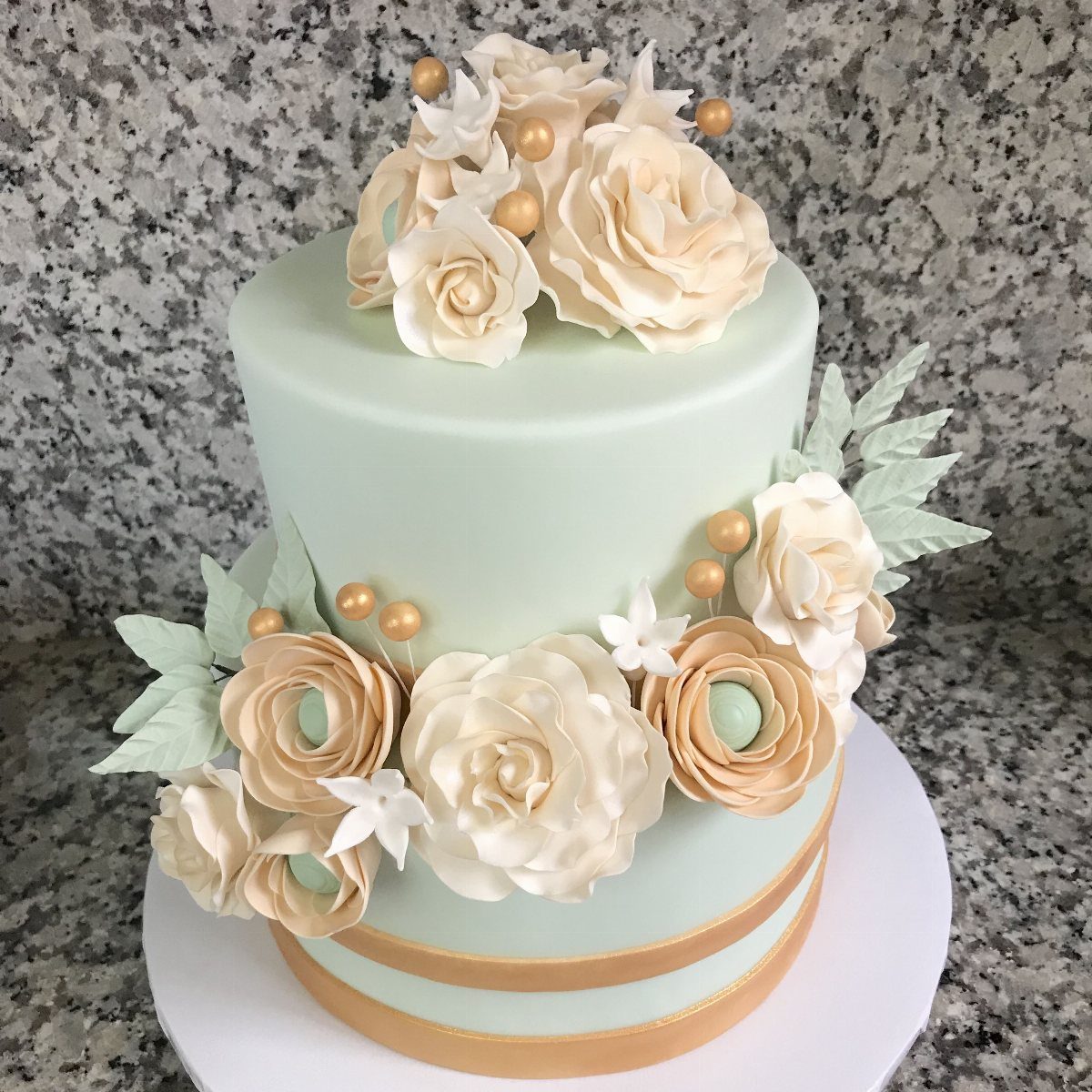
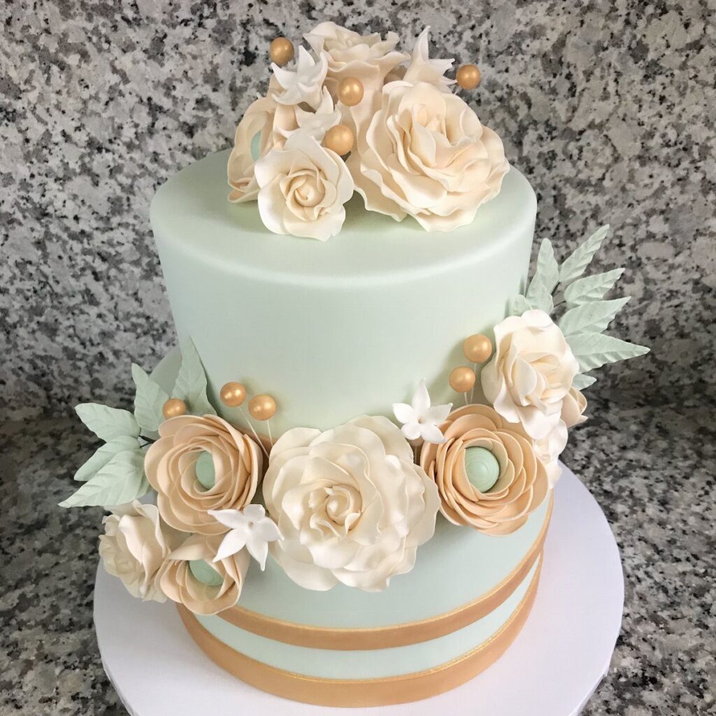
A mint and gold palette reads fresh against the usual white-on-white wedding look. The color works across tiers, ribbons, and glass details without fighting itself.
I would keep the gold to thin bands and small accents rather than large plates or heavy patterns.
Too much metallic weight and the mint goes from cool to cold. The sequined table runners some pair with this are optional; they add light but also texture that competes with lace gowns if your party wears them.
Mint macarons make an easy favor that carries the color outright. For stationery, gold glitter on cream stock handles the pairing without mint ink that can scan as bridal shower rather than wedding.
2. Burgundy Flowers and Blush Linens
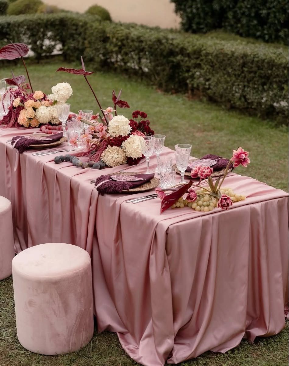
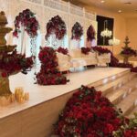
Blush linens with burgundy flowers give you depth without the full darkness of a wine-colored room. The blush keeps light on the tables; the burgundy brings the gravity.
This suits outdoor receptions where sun will bleach paler colors by afternoon. The anthuriums in the arrangements hold their shape in heat better than garden roses, a practical note if your date sits in late summer.
Gold accents on glassware or flatware bridge the 2 colors cleanly.
Without them, the pairing can feel like two palettes collided rather than one choice made. Champagne and ivory read as options here, but each dilutes the contrast that makes burgundy and blush work; I would stop at 2 colors.
3. Cream, Peach, and Terracotta Decor
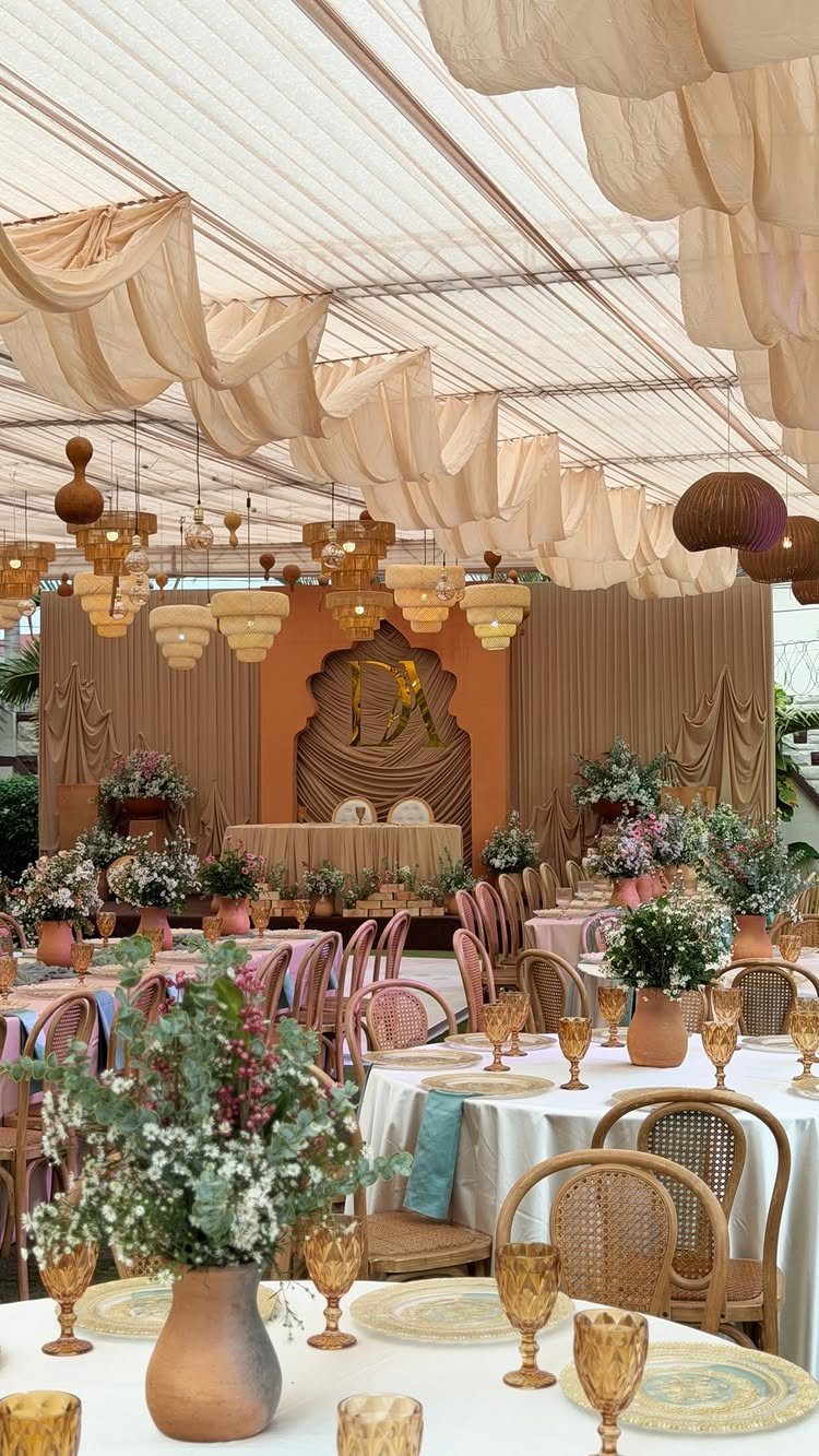
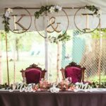
Cream, peach, and terracotta build warmth that flatters skin tones in photos taken through late afternoon. The terracotta vases and arch backdrop in this version ground the softer colors against green outdoor settings.
The deep burgundy some add to this palette, per the notes, works as a single accent rather than a competing main.
One dark wine napkin or a few stems in each arrangement carries it; more and you have shifted to a different palette entirely.
Cane chairs and draped fabric overhead keep the tent from reading as temporary. The gold initials on the arch are a detail I would scale to the guest count: visible enough for 40, unnecessary statement for 200.
4. Pastel Colors
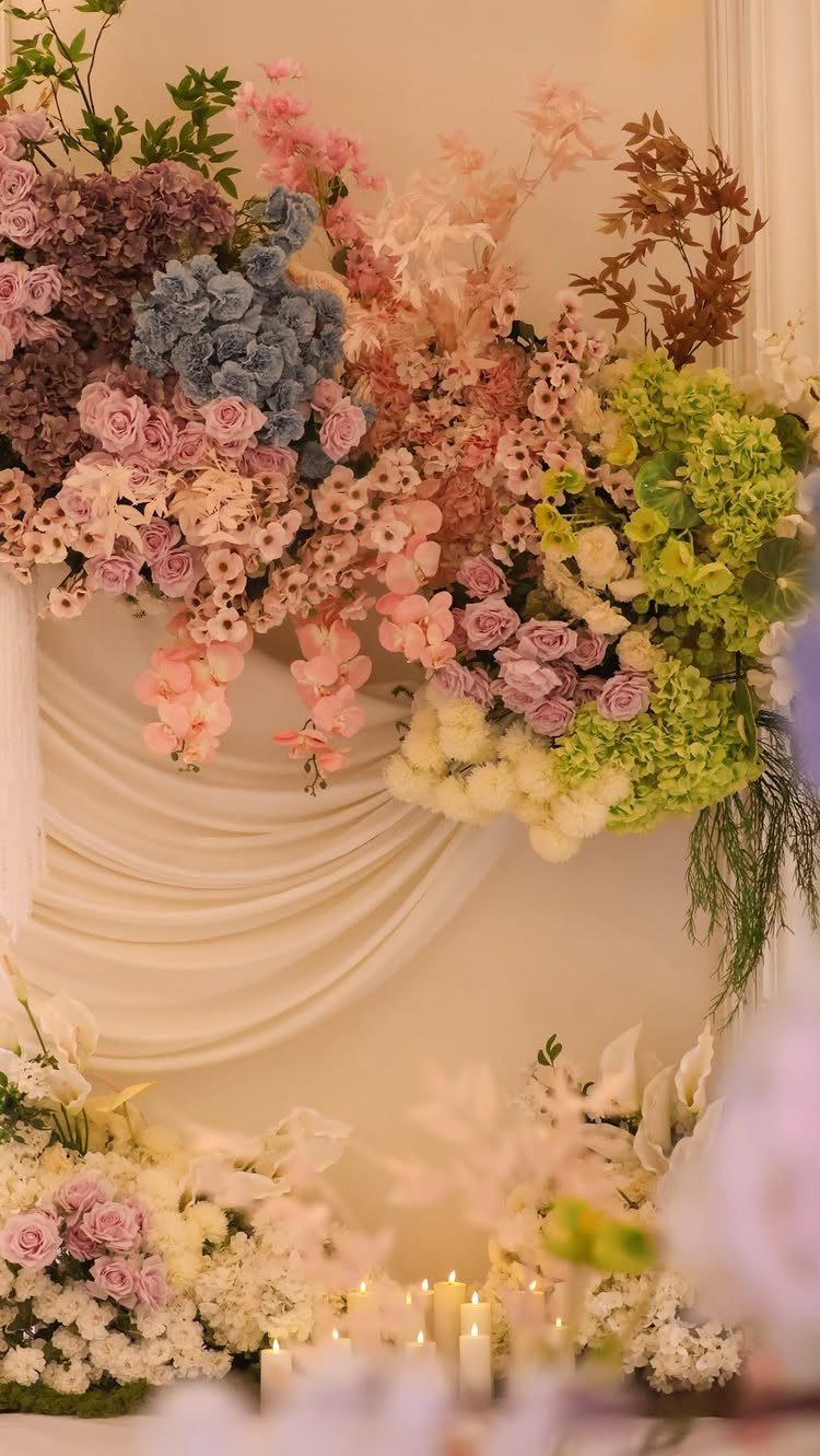
Pastel palettes survive best when one color leads and the others support rather than competing in equal measure. Blush, dusty blue, sage green, and ivory together risk nursery tones unless you handle the balance.
Pastel colors deliver a light, dreamy mood when kept matte and muted rather than bright; glossy finishes turn them childlike fast. Satin finishes on bridesmaid dresses or glassware push pastels toward Easter; chiffon and linen keep them in wedding territory.
I would use the sage in foliage rather than fabric, where it reads as grown green rather than mint. The dusty blue suits tableware or stationery, where it sits still long enough for guests to register it as intentional.
5. Black Decor and Gold Accents
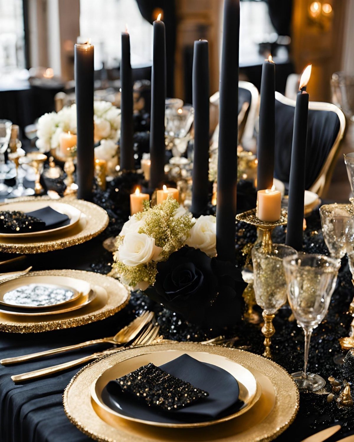
Black table linens with gold flatware and chargers make a statement that depends entirely on your venue’s existing light.
A room with windows handles this; a dark ballroom wants candles, many of them, and the tall black tapers here are not enough alone.
The crystal stems with gold glitter add points of reflection that keep the black from absorbing all attention.
I would keep the floral centerpieces to white with black accents rather than full dark blooms, which can vanish into the linen in photographs your guests will take with phones.
This palette trades the usual wedding softness for formality. It suits evening timing and a guest list comfortable with dress codes; afternoon or outdoor settings fight it.
6. Pink, Coral, and Orange Floral Arrangements
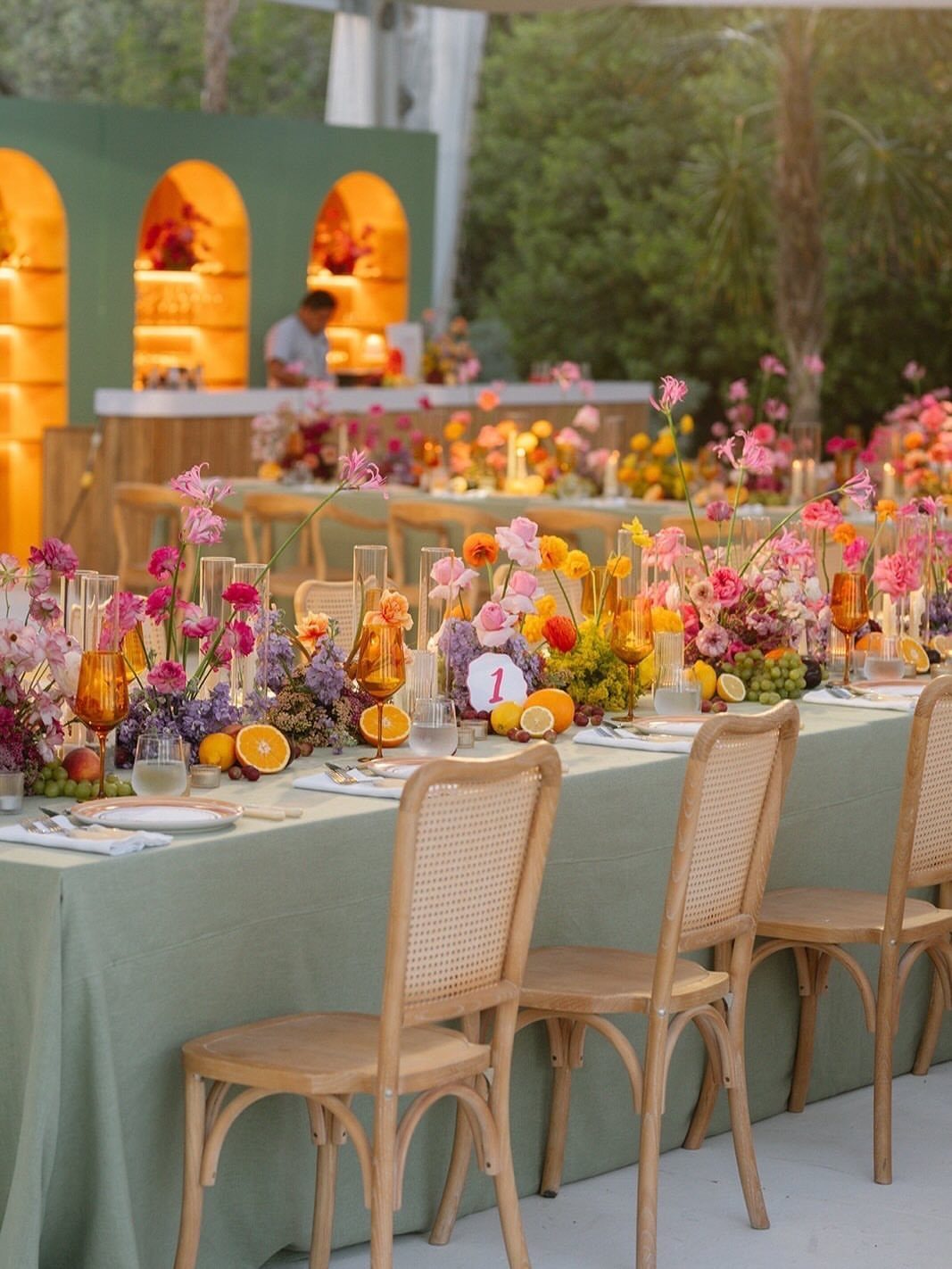
Pink, coral, and orange florals with sage green linen keep the color in the flowers where it moves, rather than in fixed decor where it might overwhelm.
The sliced citrus on the table repeats the orange tone practically; guests can eat it, and it costs less than extra blooms.
This palette wants natural light. Indoor or evening versions need more white or cream nearby to keep the colors from turning neon under artificial bulbs.
Wooden chairs and a matching bar add neutral warmth that separates pink, coral, and orange from a green linen without introducing a new color.
I would limit the yellow to citrus and small floral accents. Full yellow arrangements shift this toward a different, brighter palette that fights the coral rather than building with it.
7. Light Blue and White Decor
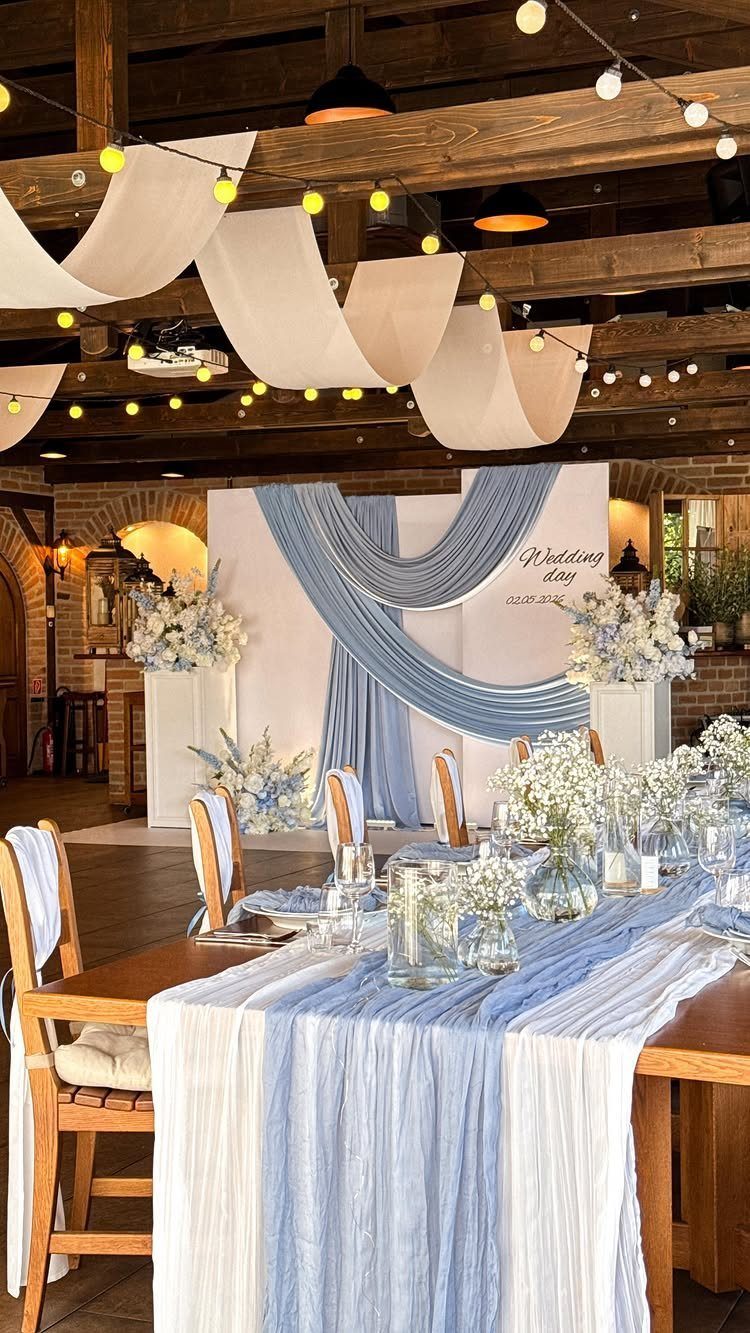
Light blue and white keeps a reception airy without the formality of all-white. The draped ceiling in this version softens a rustic barn into something that feels finished rather than borrowed.
I would use the blue in fabric, table runners, and the backdrop where it can be lit, rather than in flowers where hydrangeas bruise and brown by evening.
White roses and eucalyptus carry the white cleanly; sunflowers, if you want them, need a grey or cream table runner to keep the yellow from reading as a third color.
String light warmth against cool blue fabric is the balance that makes this work. Too much blue and the room turns cold; too little and you have white linens with a hint.
For a spring or summer wedding, this suits guests in light grey or silver rather than black, which fights the softness.
8. Purple and White Florals
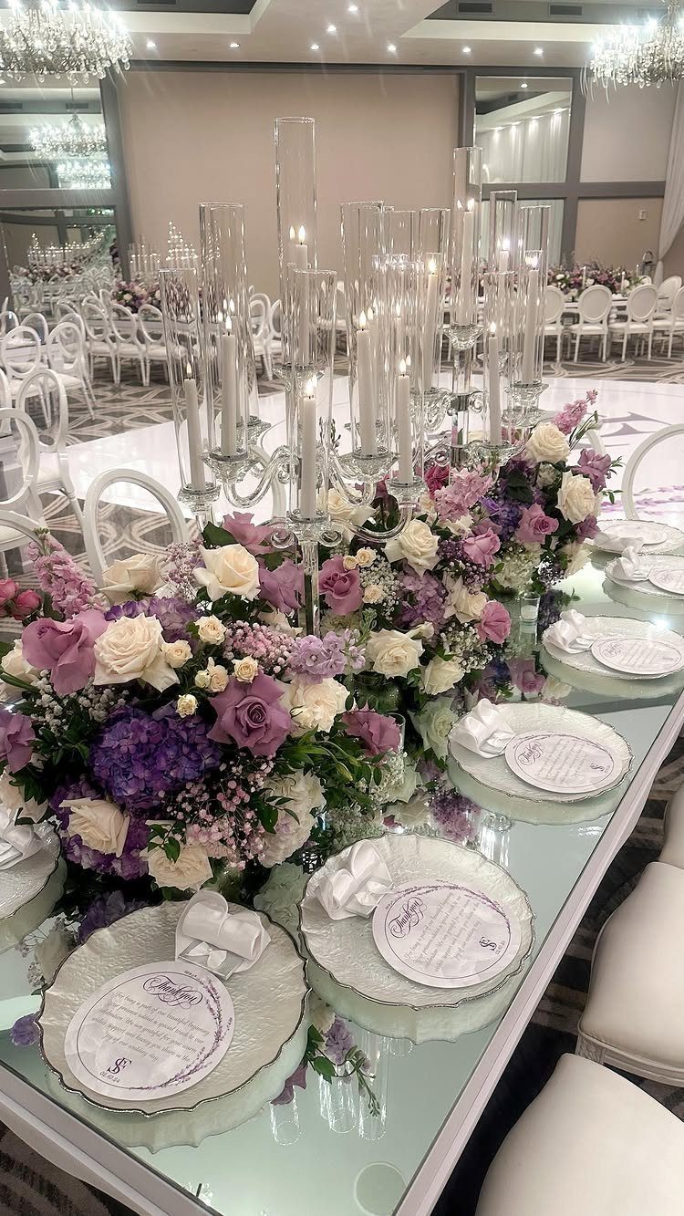
Purple and white on a formal banquet table reads as evening by nature; the color needs the lowered light that tall candelabras provide.
The mirrored top here doubles both the candle and the bloom, which means the arrangement can carry fewer stems and still fill the eye.
Hydrangeas give the purple its volume cheaply against more costly lavender roses. I would keep the purple to 2 tones at most; the orange and yellow in some related palettes shift this to autumn and a different mood entirely.
This palette wants a seated dinner rather than buffet or cocktail format. Guests need the table time to register the detail, and the candlelight needs the duration to matter.
Choosing a Wedding Color Theme
Season matters more than most couples expect.
Spring palettes lean fresh and light; summer can carry saturation that would look loud in March. Your venue’s fixed colors, the carpet you cannot change and the wall paint that stays, set boundaries whether you notice them or not.
I have seen a burgundy and blush scheme clash with a venue’s terra cotta roof tiles that looked fine in photos taken at noon but dominated at golden hour.
Personal style sounds vague until you test it. Pull fabric swatches in the actual material, not screen colors, and look at them in the light your venue gets at your ceremony time.
A palette that reads romantic on Pinterest can turn muddy under oak canopy or fluorescent hall light.
Combining Colors Effectively
Complementary colors sit opposite each other on the wheel, but wedding palettes need restraint more than theory.
Two bolds together fight; one bold against neutrals lets guests register what you chose. The black and gold entry in the list works because black absorbs and gold points; reverse the ratio and you have a different effect entirely.
Balance means counting instances, not just intensity.
Incorporating Colors Into Decor
Flowers carry color with movement; linens and stationery hold it still.
The list uses this difference deliberately: pink, coral, and orange stay in arrangements where they shift with light and angle, while sage green anchors in tablecloth that does not change.
Table settings distribute color in layers guests see from above. Runners read differently than full cloth; chargers frame a plate where flatware only edges it.
Stationery sets expectation before the day.
Trends in Wedding Colors
For 2026 and 2027, earthy tones, pastels, and specific saturated colors are taking over: butter yellow, black cherry, dusty blue, warm chocolate, muted lilac, soft apricot, and mineral green.
Navy persists in rustic settings paired with sunflower yellow and natural wood, a combination that reads established rather than emerging.
Earth tones gain ground against the cooler grays that dominated earlier in the decade.
Warm chocolate and mineral green suggest a shift toward colors that photograph with skin rather than against it, a practical concern for outdoor ceremonies where late sun matters.
Metallics appear across the notes as pairing elements rather than leads.
Dusty blue with neutral tones and metallics; soft apricot similarly. Gold works as a bridge between palettes that would otherwise collide, playing a supporting role that lets your named color carry the whole identity.
Frequently Asked Questions
What is the best color theme for a wedding?
The best color theme depends on your season, venue, and personal style rather than a single universal answer.
Mint and gold, dusty blue and sage green, and sunset palettes like burgundy with blush are popular choices that photograph well and suit different settings.
What are the wedding color themes for 2026?
Warm chocolate and mineral green are pulling ahead of the cooler grays that filled earlier-decade Pinterest boards. Butter yellow, muted lilac, soft apricot, and dusty blue all read as fresh when paired with neutrals and quiet metallics.
Black cherry is showing up as a saturated accent, while navy still holds ground in rustic setups alongside sunflower yellow and raw wood.