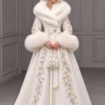
These sixteen palettes range from a single rental-standard linen to full velvet-and-foliage installations, and the one that belongs to your wedding depends on whether your venue supplies half the color already or starts as a blank box.
Butter yellow against chocolate brown groomsmen suits is one pairing that lands warm and sharp without either tone fighting the other.
1. Butter Yellow
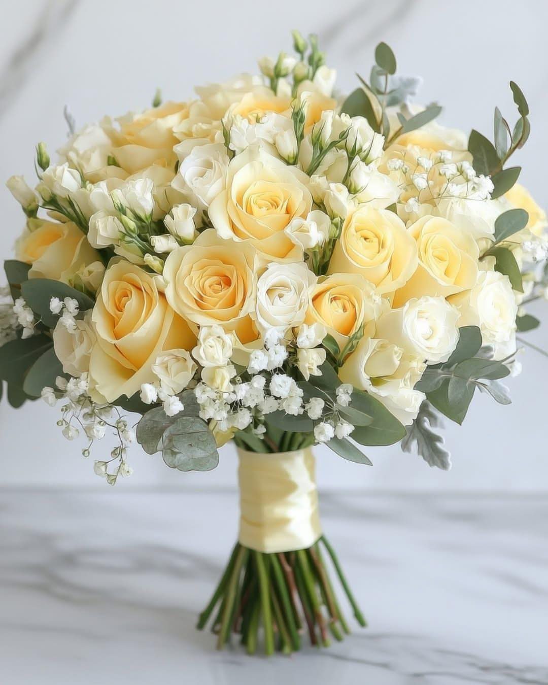
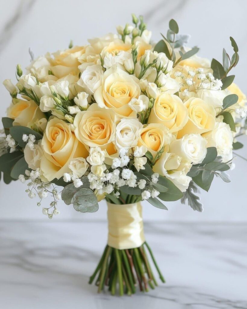
Butter yellow sits somewhere between afternoon light on silk and actual spice, warm enough for a garden ceremony and sharp enough to hold its own against a city skyline.
I have watched it soften chocolate brown groomsmen suits and pick up the silver in a dusty blue tablescape without either palette feeling forced.
For summer 2027, this shade moves best through texture rather than flat color. A satin ribbon on a bouquet reads differently than the same shade pressed into handmade paper for menus, and both land harder than buttercream alone.
Try ranunculus or single-stem roses for florals, and let petals or yellow-hued fruit do the work on cake instead of colored frosting.
2. Dusty Blue and Soft White
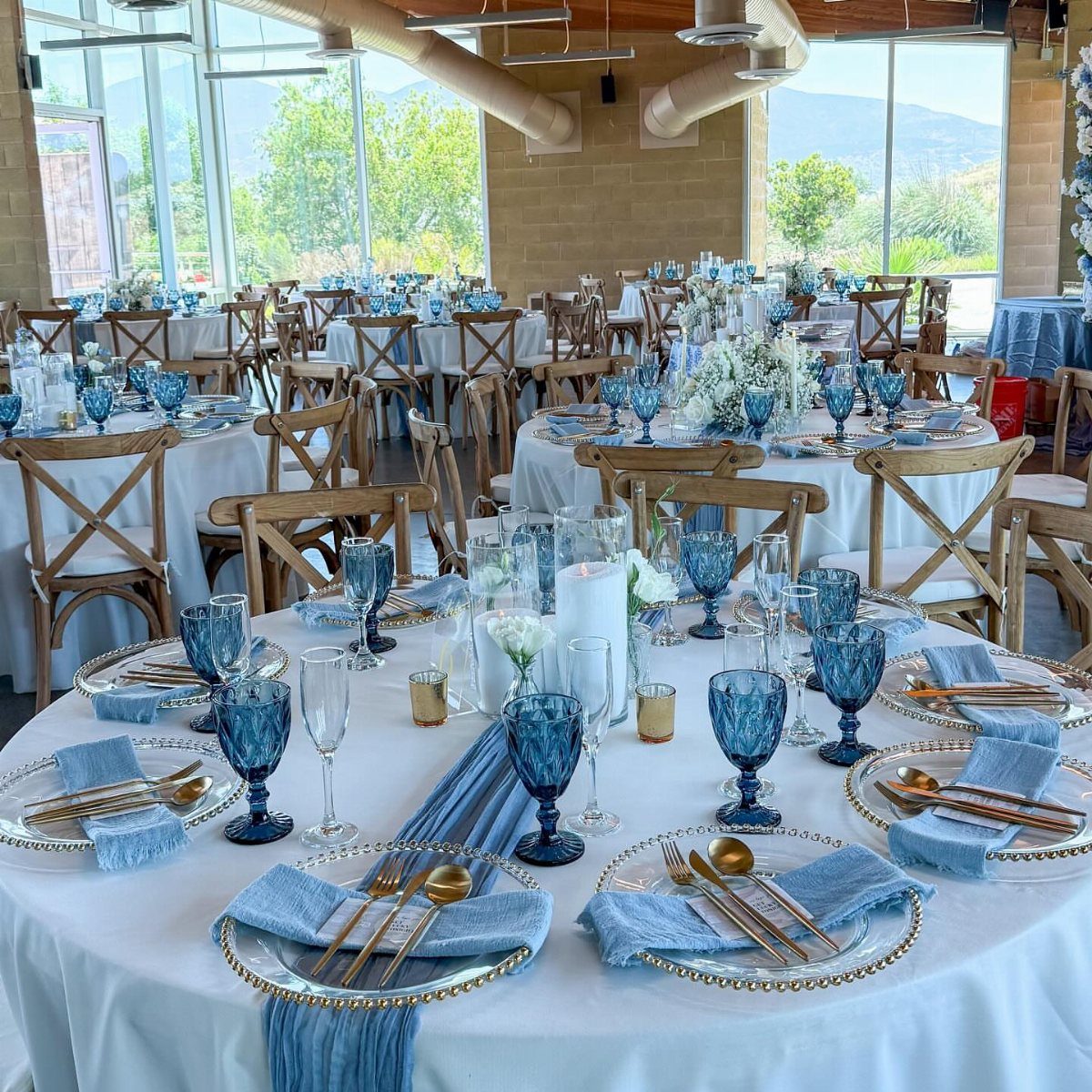
Dusty blue keeps pulling couples in, and the small shift I am seeing for 2027 is warm gold stepping aside for cool silver.
Chrome candleholders and silver-rimmed glassware against soft blue hydrangeas read fresher than brass accents now, and the palette stays just as easy to wear across a bridal party.
I would put this in any venue with natural light, where the color keeps its depth instead of washing out.
Powder blue suiting for summer grooms is genuinely workable, and the same tone through accessories avoids the matchy pressure of identical bridesmaid dresses.
3. Chocolate Brown and Ivory
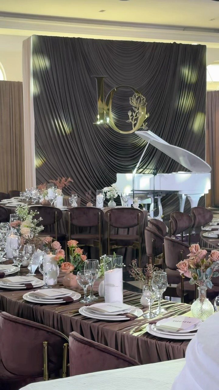
Chocolate brown earned its 2027 moment by solving a real problem: how to keep a warm neutral from going flat.
The contrast between deep espresso and pale ivory or oat is what does the work, and the same 3 colors can read modern or romantic depending entirely on whether you run them through raw linen or glazed ceramic.
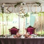
Velvet chairs in the darker tone, pampas grass and caramel tapers in the lighter ones, give a reception depth that photographs well after sunset without ever depending on black.
For couples working with a modest budget, this is one of the simpler palettes to source: brown table linens are easier to find at rental standard than dusty rose or sage, and ivory candles sell in bulk year-round.
4. Spring Green and White
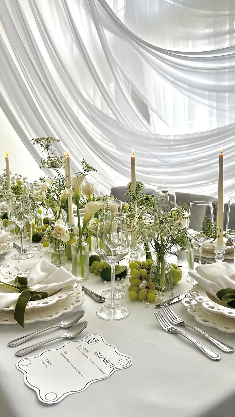
Spring green and white moves past muted sage into something more alive, and the balance is letting green carry the structure while white keeps it from going sweet.
Grapes and limes on a table do more than garnish; they give the eye something vivid to rest on between florals.
For a summer 2027 garden wedding, this palette needs less staging than most.
Cascading greenery and white ranunculus, maybe some sculptural leaves, and the setting does half the work. Meadow and pale leaf tones work best as transition colors in ribbon or stationery, not as main players.
Keep the green crisp enough that it would still read green in March, and you avoid the pale-pink trap that turns garden weddings into baby showers.
5. Midnight Blue
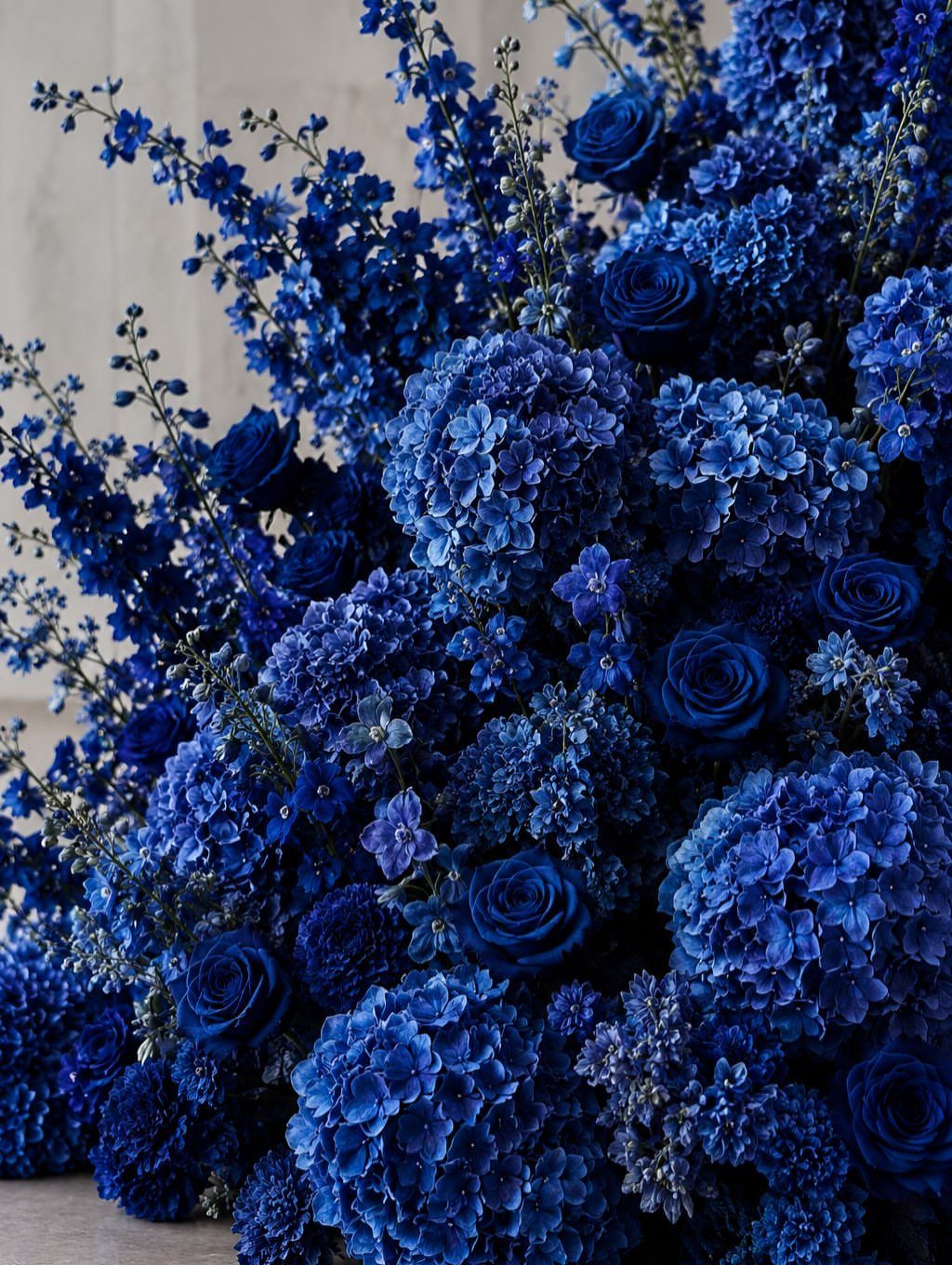
Deep navy linens, chrome candleholders, and white garden roses build the look; the silver reads as starlight without requiring actual metallics everywhere.
I would reserve this for evening celebrations or spaces where you control the light.
It can go heavy in large doses, a full midnight blue linen or a dramatic stationery suite carries more weight than scattered accent details, and the deep tone lets you use less overall decoration.
For summer 2027, balance with ice white or champagne keeps it season-appropriate without losing the drama.
6. Emerald and Gold
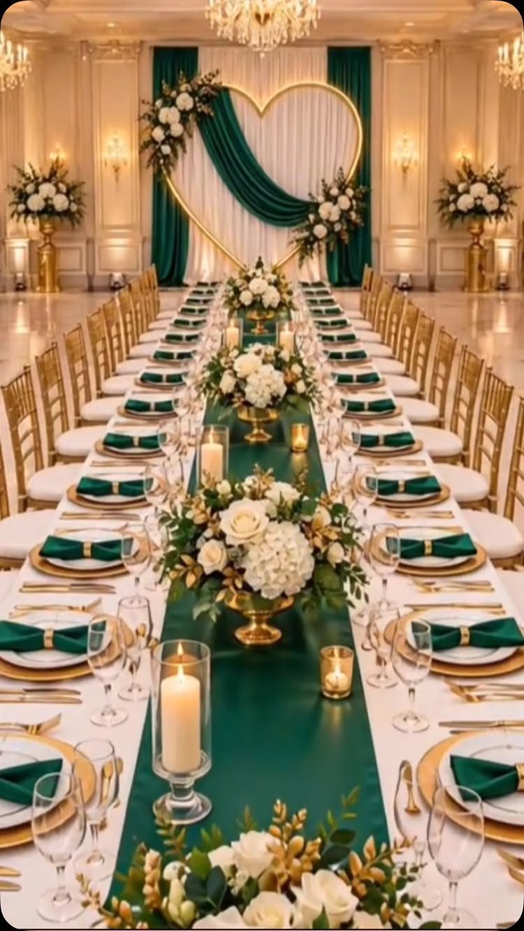
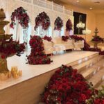
Emerald and gold is the palette I would choose if the budget allowed velvet and deep foliage, and for 2027 the trend pushes even deeper into forest green and darker leaves.
A single statement piece, like a heart-shaped backdrop, carries the opulence without requiring every table to compete at the same volume.
Gold chargers against emerald runners give each place setting its own frame, and white florals keep the whole thing from going Victorian.
For couples not ready to commit to full emerald linens, the same effect works through deep green napkins or a single runner with gold candleholders.
Warm lighting is not optional here; without it, the green goes flat and the gold reads as brass.
7. Deep Plum and Aubergine
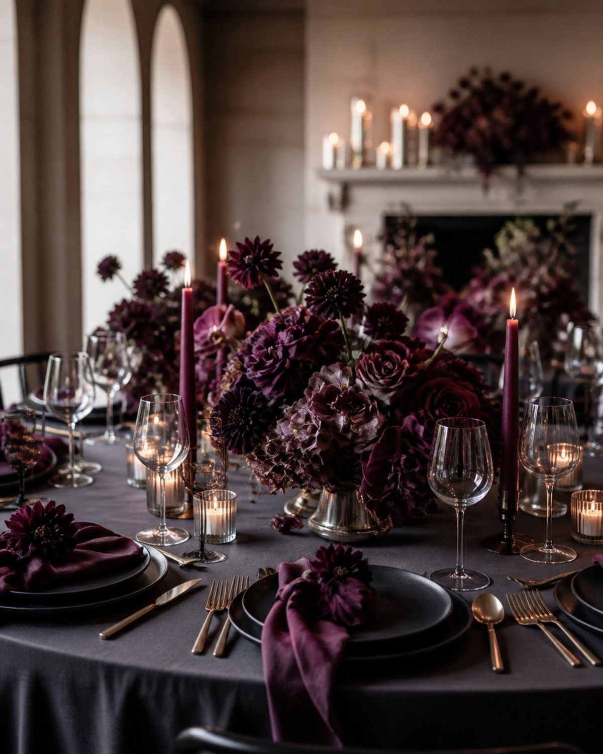
Deep plum and aubergine carry 2027’s purple direction into territory that reads grown-up rather than playful.
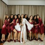
The shift away from softer lavender means this palette works best when you commit to depth: velvet linens in the darker tone, warm ivory or champagne as the relief, and blush only where it keeps the whole thing from turning gothic.
Taper candles in plum are easier to source than matching florals, and they do more to set the room.
I would use them as the thread that runs from ceremony to reception, with floral arrangements varying in darkness as the light changes.
For couples who want color without brightness, this is the trade: sophistication for cheer, and it suits evening or candlelit spaces where the tones can sink in.
8. Pastel Wildflower Palette
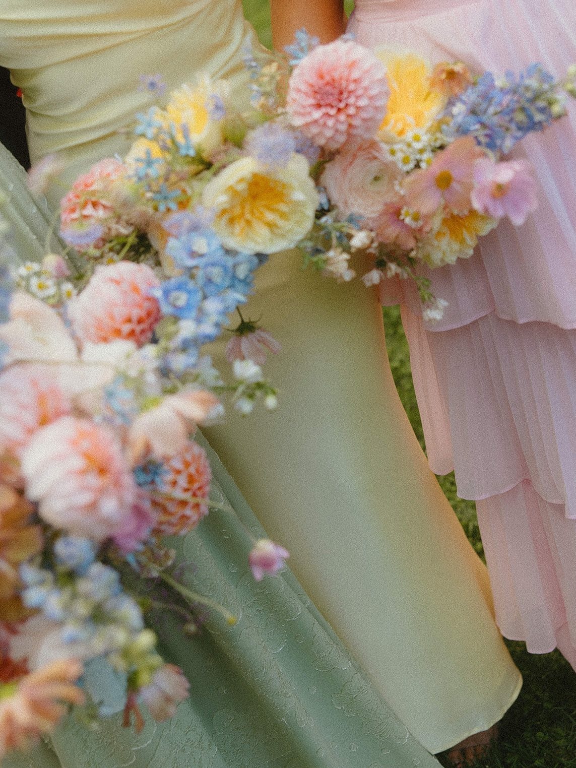
Pastel wildflower palettes live or die by whether the colors stay soft enough to let the flowers do the talking.
Separate pastels work better than one forced match: pink, yellow, and sage green each get their own wearer, while the bouquet pulls them together with something livelier.
For 2027, this works best outdoors where natural light keeps pastels from going chalky.
The wildflower element means you can use seasonal blooms without fighting for peonies out of season, and the mix of heights in a meadow arrangement covers more table area than formal florals for the same stem count.
Keep stationery simple; the palette already carries enough variation.
9. Neutral White and Warm Wood
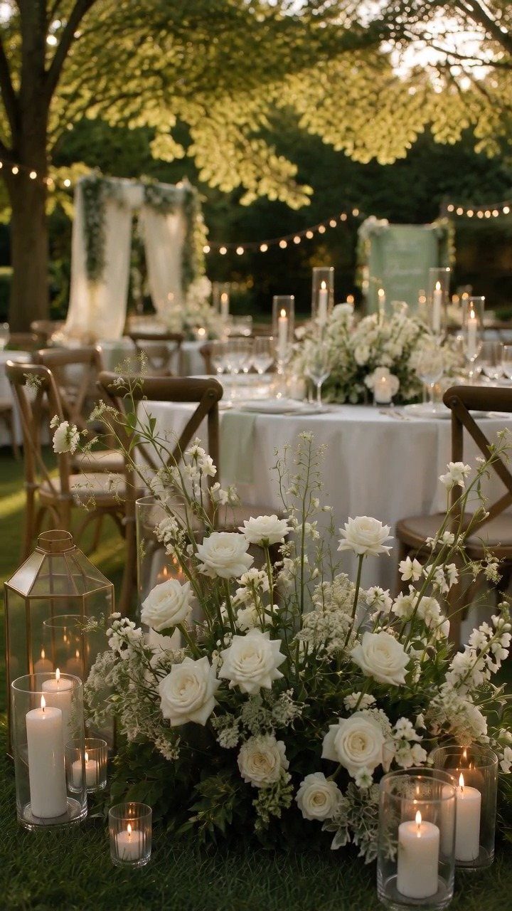
Neutral white and warm wood solves the problem of outdoor evening receptions where color can turn muddy under string lights.
The white stays crisp because it is the color doing the work, not the flowers or the fabric competing for attention, and the wood chairs give the eye somewhere warm to land between all that coolness.
For 2027, the move is layering texture within the white family rather than bringing in metallics.
Linen, cotton, and silk in ivory and off-white read as more editorial than minimalist, and the palette holds across seasons because it depends on material rather than bloom time.
This is one of the simpler setups to source: white candles and white linens are rental standards, and wood chairs are easier to find than colored upholstery in most markets.
10. Citrus Punch and Bright Coral
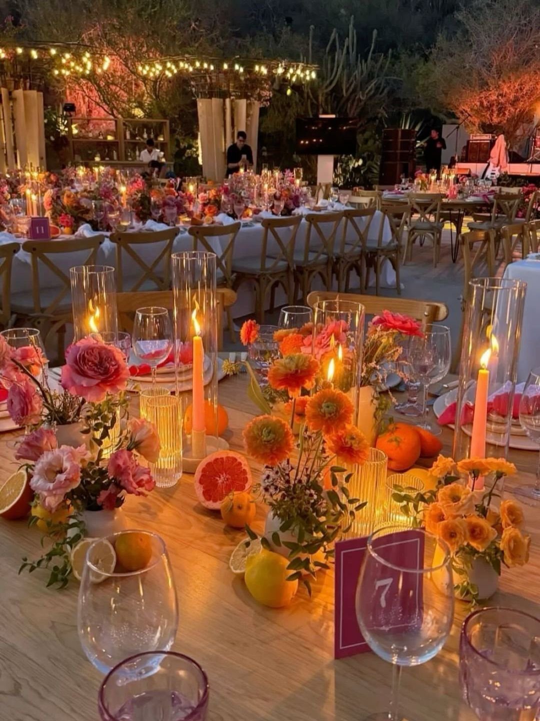
Citrus punch and bright coral brings in energy that flatters tanned summer skin and photographs with real saturation under evening light.
The cut fruit is not garnish here; it is structure, doing the same work as a runner or charger at a fraction of the cost, and it signals that the party will not feel stiff.
For 2027, this palette suits couples who want their cocktail hour to start the celebration rather than bridge it.
Grapefruit and lemon wedges in water glasses, whole citrus piled at table centers, and coral blooms that read closer to orange than pink keep the tone joyful without tipping into tropical theme.
I would keep the glassware simple; cut crystal competes with this much color, and plain tumblers let the table do the work.
11. Mismatched Multicolor Brights
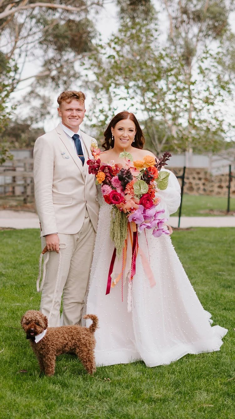
Mismatched multicolor brights is the palette for couples who stopped asking whether their wedding looked like a wedding.
A bouquet that carries pink, orange, yellow, and blue without any one dominating is harder than it looks: too much planning and it reads as circus, too little and it reads as accident.
The trend runs toward combinations that would have seemed wrong until recently. Cobalt and butter yellow, burgundy and blush, red and pink: each pair needs one warm and one cool tone to keep from vibrating.
I would choose one combination and repeat it, rather than sampling from several. The groom in neutral beige lets the bride carry the color story, and that division of labor keeps the couple from competing with their own palette.
12. Sage and Cream
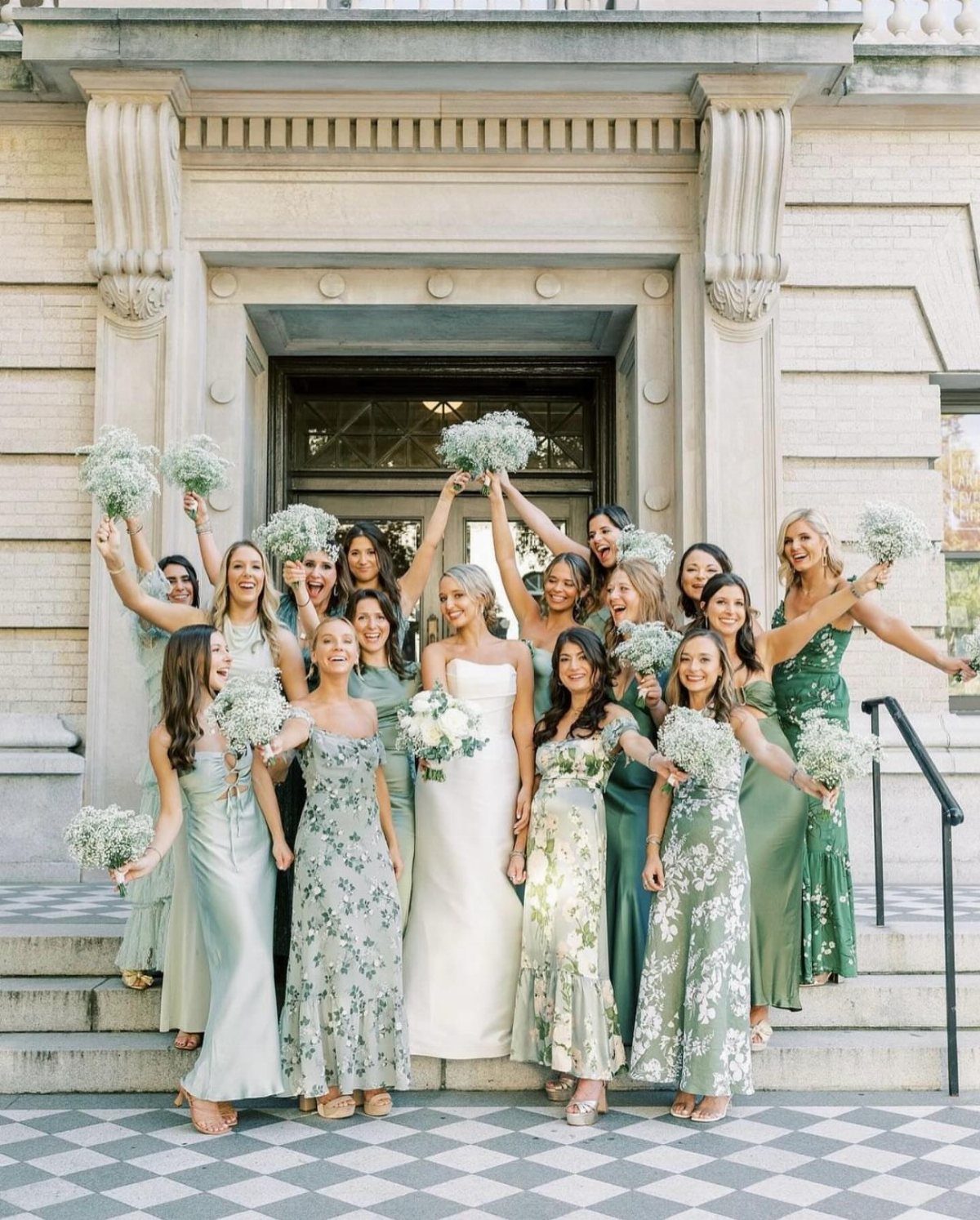
Sage and cream stays usable because it reads as a color choice rather than a theme, and for 2027 the shift is pairing sage with dusty lavender instead of the usual blush or ivory.
Both tones are muted, so neither fights the other, and the result feels botanical without requiring actual botany.
Solid and floral versions of the same green family solve the matching problem without giving up cohesion.
For a summer wedding, I would keep the cream warm rather than stark white, and let the greenery in arrangements stay loose rather than structured.
This palette suits garden and outdoor ceremonies where the setting already supplies half the green, and it needs less floral budget than bolder colors because the eye expects restraint.
13. Tropical Orange
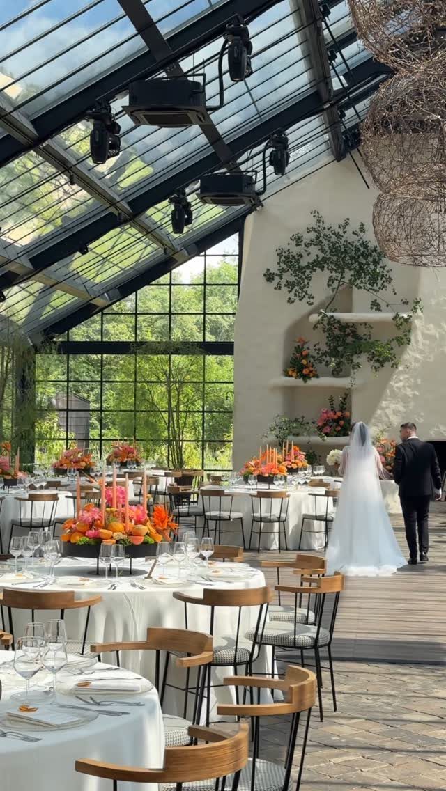
Tropical orange reads as destination even when the venue is domestic, and for summer 2027 it is moving past accent status into full palette territory.
Bird of paradise and heliconia carry it without looking like a theme park, especially when dark green foliage provides the grounding that keeps orange from floating away.
I would use this for late-afternoon ceremonies where the light is already warm, letting the color meet its match instead of fighting the sun.
Tall arrangements do the heavy lifting; shorter ones can read as fruit salad. An Aperol signature cocktail or citrus-glazed dessert extends the palette to the palate without requiring an orange cake, though that door stays open if you want it.
Glassware stays simple here, and stationery can carry the full weight of first impression. The trade is energy for elegance: this palette parties hard and needs a couple ready to own that.
Mixing Colors
Layered tones, unexpected pairings, and monochrome moments built on texture rather than color variation are what read as current now.
Butter yellow and cobalt blue is one combination that lands bright and photogenic without feeling forced. Chocolate brown and pale blue warm up a pairing that would have seemed off a few years ago.
Red and pink now carry a fashion-forward energy that earlier generations would have avoided. The rule is one warm tone and one cool tone, repeated rather than sampled from several combinations, so the eye reads intention rather than accident.
If you are working with a monochrome base, let the materials do the variation. Satin ribbon, handmade paper, and velvet in the same family of color give more depth than 3 different hues competing for attention.
Seasonal Considerations
Summer heat and light change how colors look outdoors, so I start there and build around what the season actually does to fabric and flowers.
Spring and summer naturally suit lighter, fresher tones: blush, spring green, dusty blue, and champagne. Peach and brighter blues bring freshness specifically to summer celebrations.
Autumn and winter lean toward deeper, richer palettes: burgundy, midnight blue, chocolate brown, and moody mauve.
The notes from both sources agree on this direction, though they differ slightly in where they place the boundary. One source groups champagne with spring and summer; the other lets it work year-round.
A simple approach is 3 colors: a dominant shade for mood, a supporting color for contrast, and a neutral for breathing room.
From there, look at how the entire palette works together rather than whether each color is traditionally considered a wedding color.
Personal Style
Your venue already has colors in it, and your palette should complement those rather than compete.
A space with warm wood tones, warm white, and exposed brick will read differently than one with chrome, glass, and city light, and the same dusty blue or emerald will shift accordingly.
Your personal style matters more than trend. The question is whether you want the day to feel romantic, modern, editorial, playful, or moody, and which palette gets you there.
Photography is worth considering early. Garden light will wash out a pale pink that glows under chandeliers, and your wedding party will wear these colors in nearly every photo you keep.
The palettes that photograph well are not always the ones that look best in person, so test your combination in the actual light of your venue if you can.
Texture and Materials
Chocolate brown through raw linen carries a different mood than the same tone in glazed ceramic.
The practical advantage is that texture is often easier to control than exact color matching.
A rental house may not carry the precise dusty blue you saw online, but it will have linen, velvet, and satin in related tones that let you build depth without fighting for a custom dye lot.
Frequently Asked Questions
What are the wedding trends for 2027?
The biggest shift is confidence with color itself rather than chasing one "it" shade.
Couples are mixing unexpected pairings like butter yellow and cobalt blue, or burgundy and blush, and using palettes to build an experience that feels specific to them.
Jewel tones are stepping up from accents to the main event, silver is edging out gold for metallics, and color drenching, one hue carried through every surface and fabric, is what keeps showing up in the work I follow.
What is the color trend for 2027?
2027 pulls two ways at once: warm neutrals with chocolate brown and mocha at their center, and a louder thread of saturated jewel tones paired bright against bright.
Green runs through nearly every palette this year, brighter and sharper than the sage that dominated the last few seasons.
Silver reads as cooler and more modern than brass, and color drenching lets a single hue carry the whole room through varied textures.