
Black and white wedding decor runs from a few dollars for black satin ribbon to the logistical puzzle of timing a black aisle runner rollout after guests are seated.
The right choice depends on whether your venue is architecturally plain or already busy, since bold stripes and geometric wire pieces compete with existing detail while simple white linens let the space itself speak.
Black taper candles in glass cylinders give you height and movement, though someone has to wipe the soot before the doors open.
1. White Floral Centerpieces
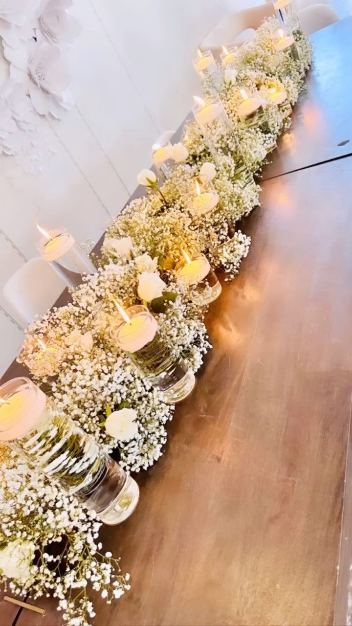
White floral centerpieces keep a black and white palette from going flat.
Roses or hydrangeas in clear glass cylinders work well, and baby’s breath adds more texture than you’d expect from one color. The floating candles in water add height without a tall arrangement that blocks faces across the table.
If you want greenery, keep it minimal and trailing rather than bushy. A few stems of seeded eucalyptus or Italian ruscus are enough to frame the white without introducing a third color that fights the scheme.
2. White Tablecloths
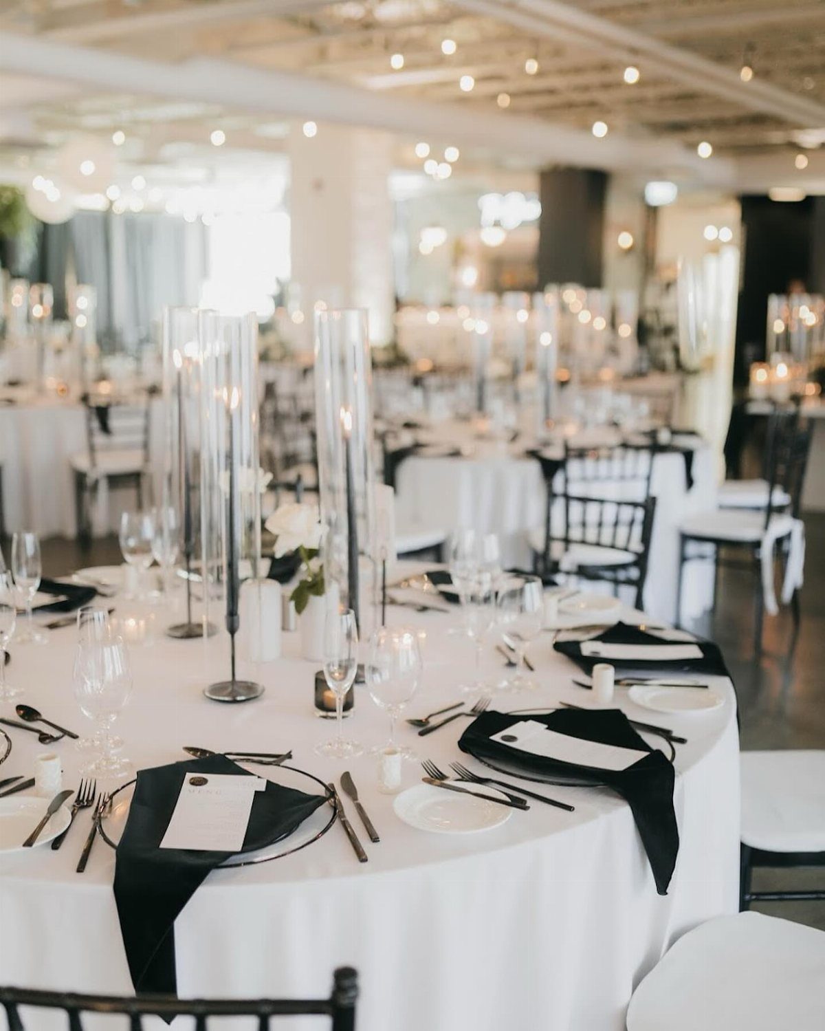
Floor-length white linens are the one item I would not try to save money on by buying short. Pooled fabric reads formal; high-water tablecloths read rushed setup.
I would skip patterned or textured white cloths for this particular look. Restraint matters, and a subtle jacquard or lace fights the clean graphic quality that makes black and white work.
3. Black Taper Candles
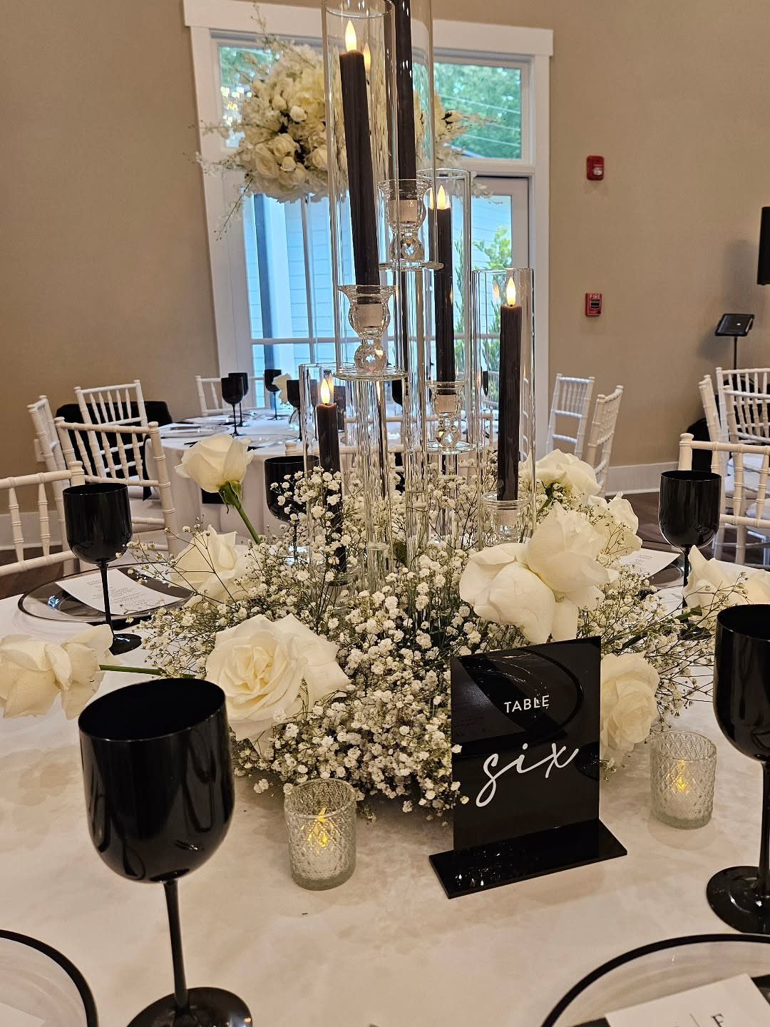
Black taper candles in glass cylinders give you height, color, and movement all at once. Black tapers among white roses and baby’s breath keep the black from turning funereal.
I would use these in gold holders if your tables are round, where the candelabra shape reads better from every angle; straight cylinders suit long banquet tables where guests see them in a row.
Soot is the downside. Black wax leaves residue on glass, so assign someone to wipe cylinders before the reception opens, or use smokeless beeswax tapers in black instead.
4. Gold Cutlery
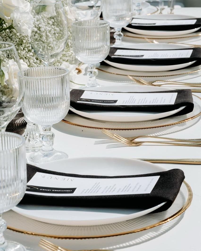
Gold cutlery is where the black and white scheme stops being stark and starts feeling like a party.
Gold cutlery with gold-rimmed chargers is doubling up; pick one gold element per place or you drift into gilded excess. Cutlery is the safer choice because guests handle it, so the metal gets noticed.
Rentals run cheaper than you might think for flatware, often only a dollar or two per piece above standard silver.
The real cost is in matching enough pieces if your guest count is large and the rental company stocks limited quantities.
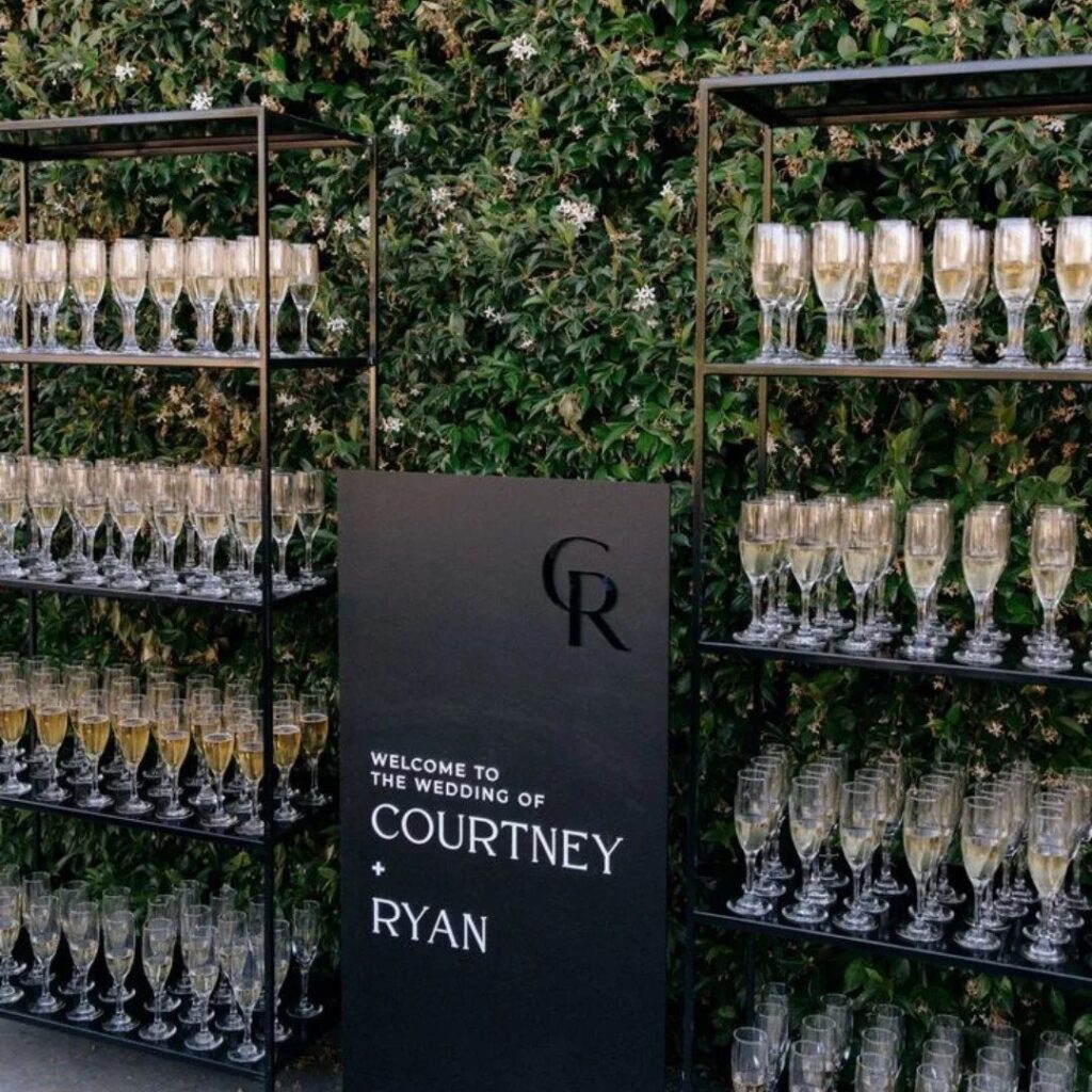
5. Black and White Welcome Signs
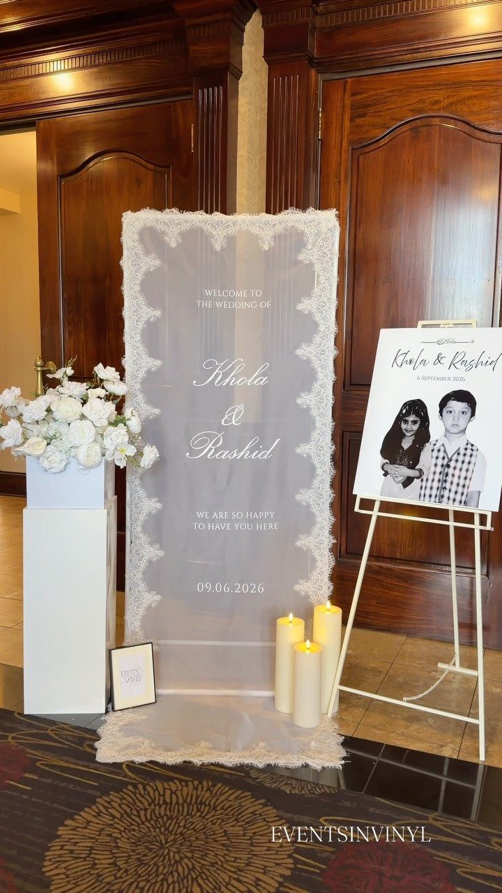
A welcome sign does practical work guests do not notice until it is missing: it tells people they are in the right place, at the right event, before they have to ask.
Lace trim softens the black and white with fabric texture, which works well for afternoon or garden settings. A matte black board with white serif lettering reads better for evening.
Size matters more than couples expect. Something meant to be read from a distance needs letters larger than you think; print a test sheet and tape it to a wall, then walk away.
6. Black and White Striped Runner
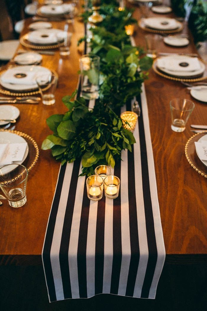
Vertical stripes running the length of a banquet table elongate the room and pull the eye toward whatever sits at the head. Horizontal stripes would fight the table shape; do not use them here.
The boldness works because everything else stays quiet: bare wood beneath, small votives, simple greenery.
Add patterned china or colored napkins and the runner becomes circus tent. I would use this only where the venue itself is plain, since stripes compete with architectural detail.
7. Black Aisle Runner
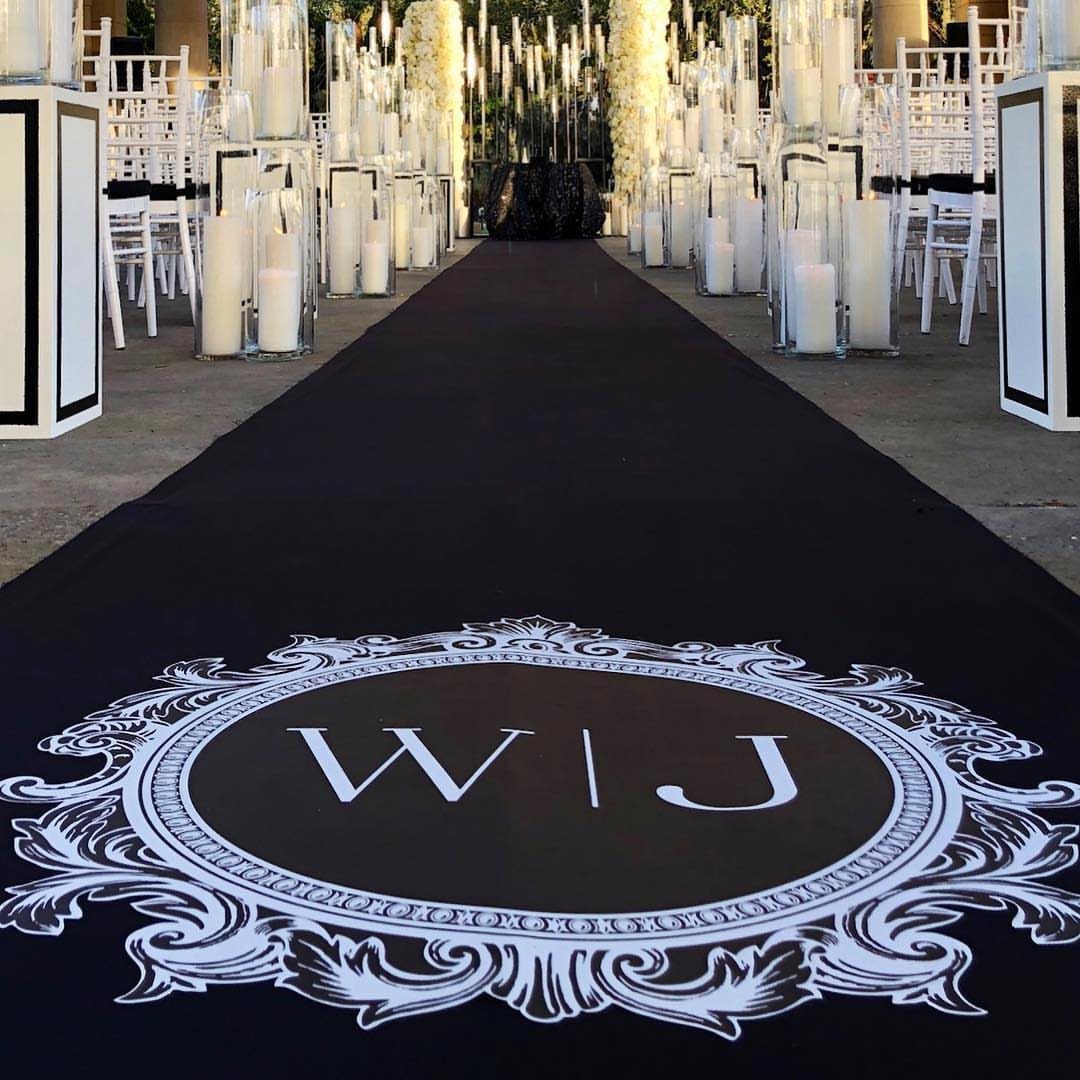
A black aisle runner printed with your initials turns the walk to the altar into the ceremony’s most photographed moment. A black aisle runner gives guests’ phones the contrast they are already framing in their heads.
I would keep petals loose rather than patterned; a straight line down the center looks deliberate, scattered looks abundant.
The runner needs weight at the edges or tape underneath if the venue has any breeze. Someone has to roll it out after guests are seated, so build that into the timeline.
8. Black Draped Fabric with White Floral Arrangements
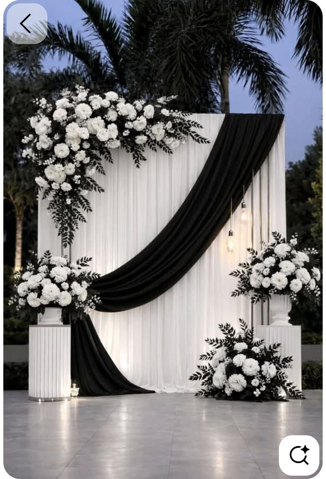
Diagonal black fabric across a white backdrop breaks up the flatness of a plain wall without adding color. White florals on white pedestals keep the contrast graphic rather than busy.
The drape angle matters more than the fabric weight. A forty-five degree line pulls the eye upward; horizontal would read as a stripe and vertical as a curtain.
Greenery is the risk here: keep foliage minimal and dark so it reads as shadow rather than color. I would follow that, since deep green against black loses definition in evening light.
9. Black Satin Ribbons
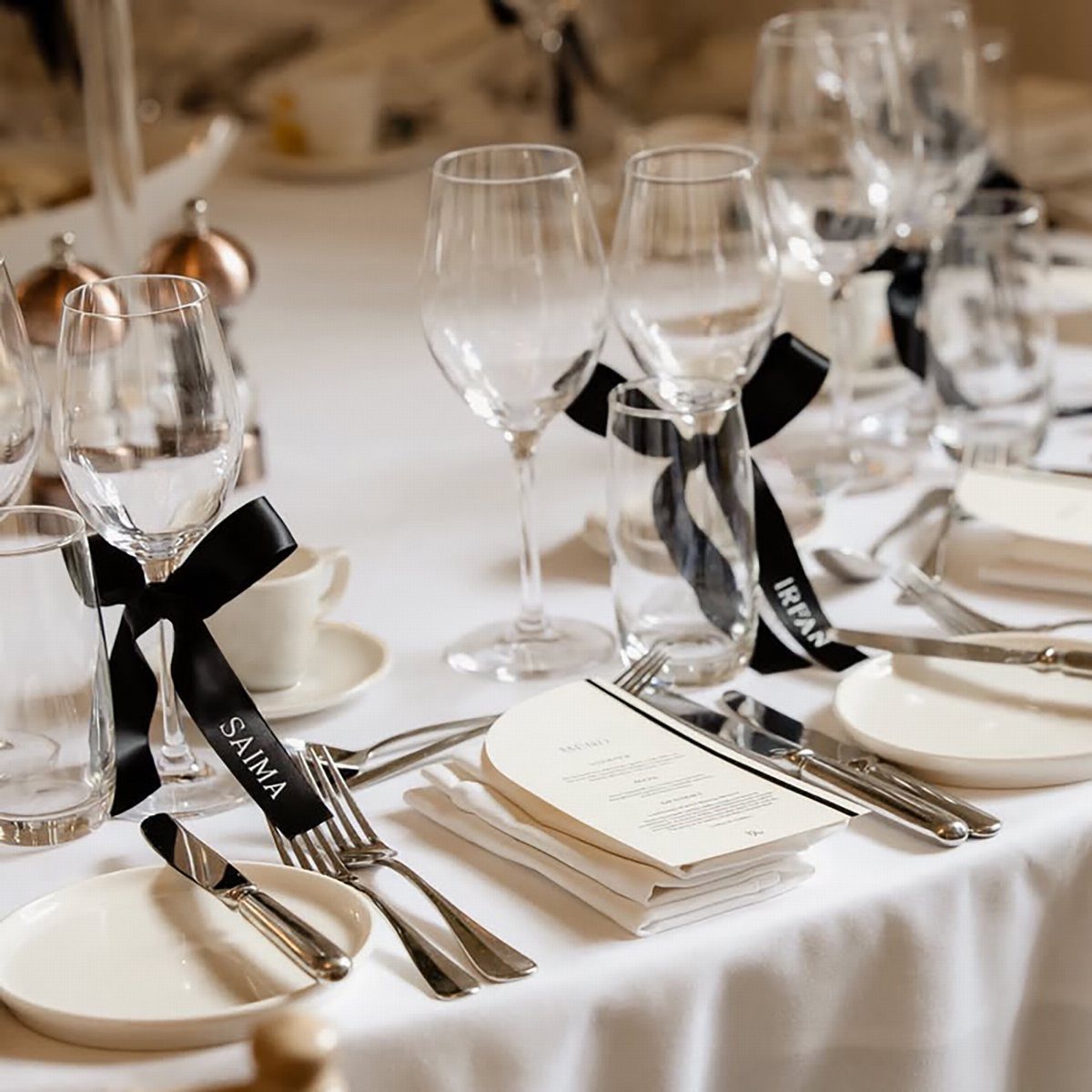
Black satin ribbon on a wine glass stem turns a rental into a place card. The sheen catches candlelight, and the narrow width keeps it from looking like a gift bow.
Chair sashes are the same material deployed larger.
Cross-back chairs with long trailing bows need outdoor space or high ceilings; in a tent with side walls, the ribbon ends tangle and collect dust. Tying onto glass stems avoids that entirely, and guests take their ribbon home.
10. Geometric Decor Elements
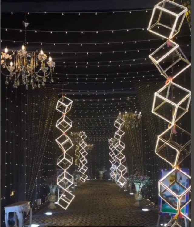
Geometric wire cubes hung in vertical strings give a dark room structure that flat signage cannot. The glow comes from within or behind; without a light source, black wire disappears against black curtains.
Signage uses the same shapes on the ground. A two-toned board with black calligraphy on white, framed in black, carries the geometry without hanging anything from the ceiling.
I would choose one or the other: hanging cubes overhead or geometric signs at eye level. Both together turns a motif into a theme park.
Color Palette Advice
Black and white works at every budget because it needs so little to read as intentional.
A church with white chairs and a simple aisle of greenery already looks considered; the same setup in blue or purple would need more help to feel finished.
The risk is flatness. Without texture or variation in tone, the palette can look like a draft that never got its colors chosen.
Lace trim on signage, matte versus glossy surfaces, or the soft irregularity of baby’s breath against hard geometry all solve this without adding a third color.
Dressing the scheme up or down happens in the finish you choose.
Serif lettering on a welcome sign reads formal; clean sans-serif reads modern. The same black and white objects shift meaning based on that one choice.
Floral Arrangements
Greenery softens the contrast, but the amount and placement need restraint.
White hydrangeas and roses on black pedestals give the aisle the high-contrast moment guests photograph most.
The scale matters: large arrangements on tall pedestals read ceremonial, low lush arrangements read intimate. I would not mix heights randomly; decide which mood the ceremony needs and stay consistent.
Petals scattered rather than patterned across a black runner look abundant rather than arranged.
Lighting Considerations
Candlelight does the work color usually does in warming a room. Either pairing works, but mixing both on the same table splits the visual focus.
The glow reflects upward, which flatters skin and softens the starkness of the palette.
Smokeless beeswax tapers in black solve this but cost more and can be harder to source in quantity. Build time into the setup schedule either way.
Table Setting Tips
Texture replaces color for adding interest. Satin ribbon on glass stems catches light differently than matte black signage; lace trim on a welcome sign reads softer than serif lettering on board.
Each material carries its own temperature, and mixing them keeps the palette from feeling like a single note played too long.
Layering needs limits.
Black napkins on white cloth, or white napkins on black, give each place setting its own small contrast without adding objects. The simplest choice is often the one that leaves room for the flowers and candles to matter.