Wildflower wedding invitations run from a printable template you assemble yourself to a hand-painted suite that pushes the timeline back by weeks.
The deciding factor is not your taste but your guest list length, since materials like twine and vellum wraps scale in labor faster than in cost.
A single proof ordered before the full run can catch whether your printer matches the watercolor border, or whether the bulk of dried sprigs pushes postage into a higher rate.
1. Wildflower Wedding Invitations with Elegant Typography
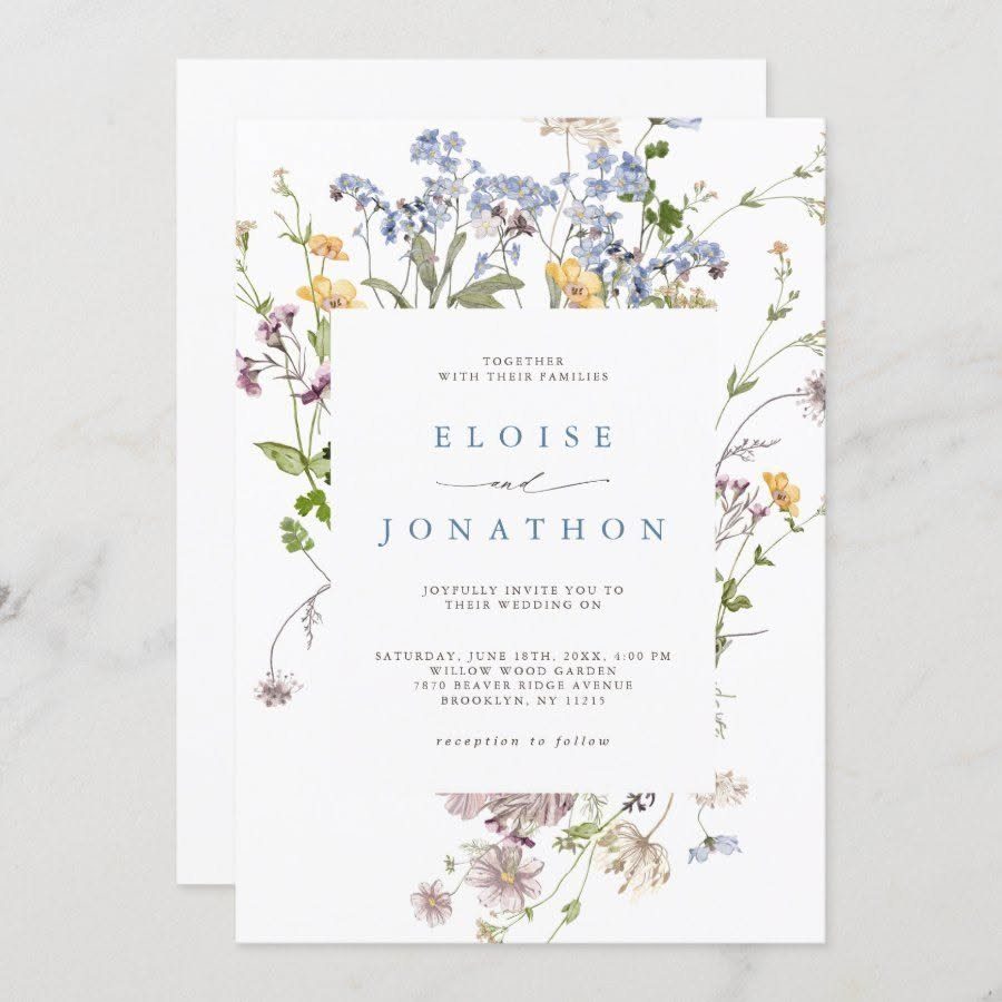
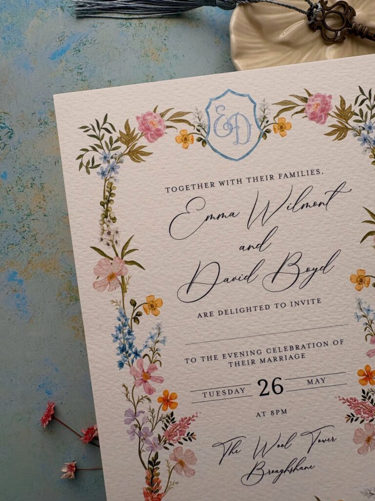
Elegant serif type sits inside a watercolor wildflower border on white stock, and the restraint is what makes it work. The flowers do not compete with the names and date; they frame them.
This suits couples who want nature in the design without the informality of loose boho styling.
Check that your printer can match the gold or black ink shown, since color accuracy matters more here than with busier layouts. A single proof is worth ordering before you commit to the full run.
2. Boho Wildflower Wedding Invitations
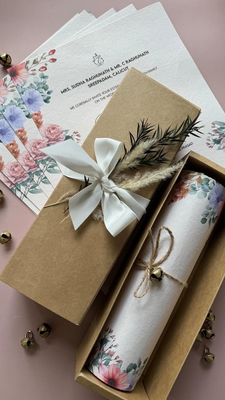
Kraft paper, twine, and dried sprigs turn a printed invitation into something that feels gathered rather than designed.
The materials are easy to source, but assembly takes time.
If you are mailing these, weigh a finished sample at the post office before you buy postage, the bulk of twine and dried stems can push you into a higher rate.
3. Colorful Watercolor Illustrations
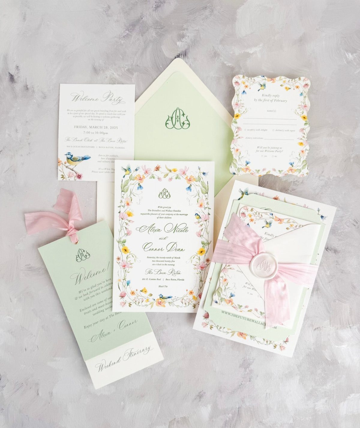
Bright watercolor wildflowers frame the text in saturated pinks, purples, yellows, and oranges, with birds sometimes worked into the border. The effect is cheerful and unstudied, closer to a garden in July than to a formal arrangement.
This is a strong choice if your wedding carries real color elsewhere, in bridesmaid dresses or table linens, and you want the paper to match that energy rather than tone it down.
Ask your stationer whether the watercolor style is printed flat or hand-painted; hand-painted raises the price per piece and pushes the timeline back by weeks. Printed watercolor keeps the look and is far more practical for a longer guest list.
4. Vellum Wraps and Jackets
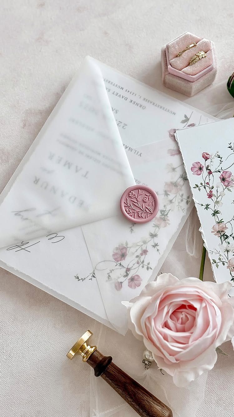
A translucent vellum wrap printed with wildflowers encloses the invitation card and is sealed with a wax stamp. The flowers show through the sheer layer, softening the whole thing before the wrap is even opened.
Vellum is delicate to handle and can wrinkle in the mail, so order extra for spoilage.
The wax seal needs to be applied after assembly to hold the wrap closed, which means either paying your stationer for the labor or setting up an assembly line with friends.
Gold wax is the classic choice; pink matches the floral tone if you want one color to carry through.
5. Deckle-edged Wildflower Wedding Invitations
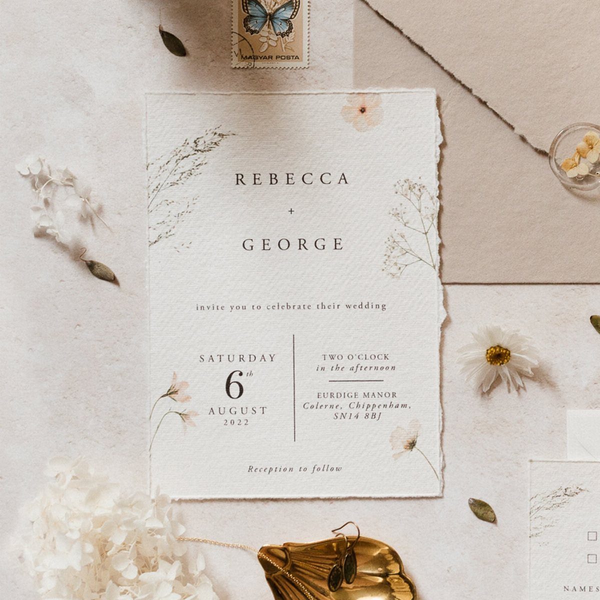
The torn, feathered edge of deckle-edged stock gives a wildflower invitation the feel of a letter pressed in a country house. The texture catches light differently than a clean cut, and it pairs naturally with loose, informal florals.
Not every print shop stocks deckle-edged paper, so confirm availability before you fall in love with a template.
The edges are fragile; plan to transport these flat and hand them to guests or use rigid mailers. The extra postage cost is modest but real.
6. Scalloped Edge Wildflower Invitations
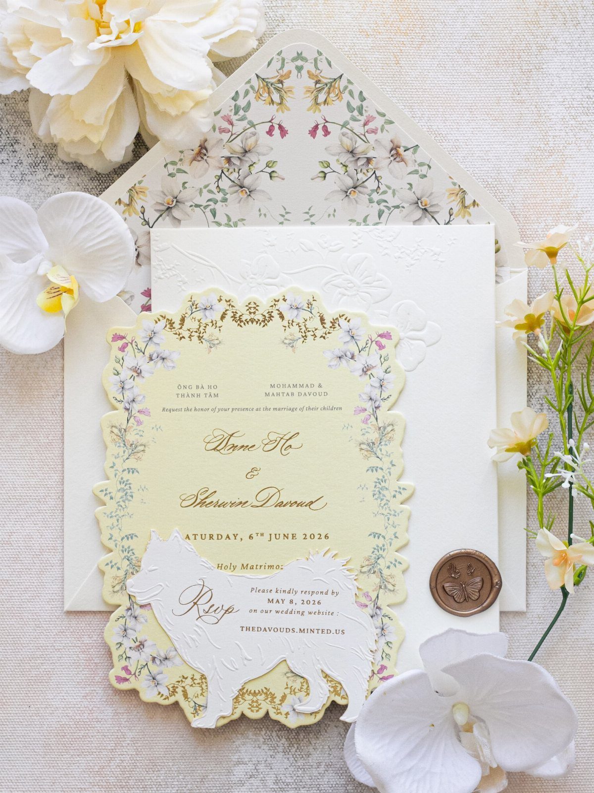
A scalloped border softens the silhouette of the card itself, turning a rectangle into something closer to a petal. Pastel watercolor wildflowers run along the edge or wreath the center, and the whole thing reads gentle and deliberate.
This shape limits your layout options, text needs clear margins inside the curve, and some printing methods handle scallops better than others.
Ask whether your stationer laser-cuts after printing or uses a pre-cut blank; laser-cutting risks slight browning at the edge on some stocks. The dog-shaped RSVP card shown is a customization you could swap for something that fits your own story.
7. Green and Yellow Botanical Suite
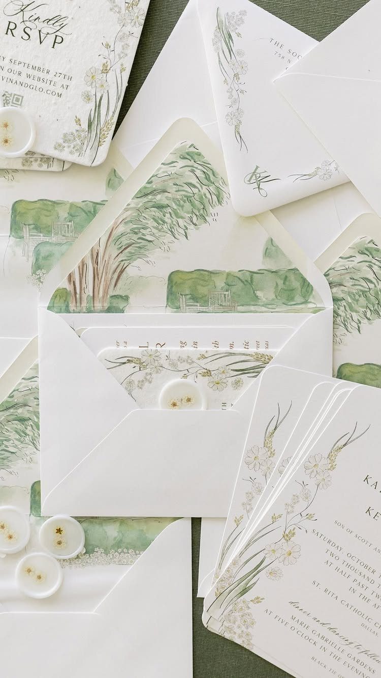
Green and yellow watercolors on white stock read fresh against the dark green envelope liner, and the whole suite keeps one foot in tradition while the other steps outside.
This palette works for spring and early summer weddings where the actual flowers outside will echo these tones. The botanical wreath format leaves room for longer names or a fuller quote without crowding.
Pressed flower wax seals, shown on the sample, add an hour of assembly per dozen if you do them yourself; buy them ready-made if your guest list is long.
Linen-textured cardstock is the safer choice for mailing; the smoother watercolor stock can show fingerprints.
A hand-painted suite like this runs higher per piece than flat printing, and the maker behind the example credits the joy in that handwork.
For a practical middle path, ask your stationer about digital watercolor on good stock: you keep the color range and lose the wait.
Nature-themed Wedding
Wildflower invitations set the tone for a wedding where the outdoors is not just backdrop but thread running through the whole day.
The pastel palettes, soft pinks and blues and peaches, pair with real blooms in the same tones, pale delphiniums and blush roses carried from paper to bouquet.
What I watch for in this look is the gap between invitation and execution. A watercolor wreath on white stock promises a garden; the venue and flowers need to deliver it.
Couples who nail this are the ones who bring their florist a physical sample of the invitation, not a phone photo, and let color matching happen in person. The paper becomes the standard everything else measures against.
Customization Options
Most wildflower designs I see now come from template libraries with fields you fill yourself, names, dates, venue, wording for the ceremony card. The editable files let you rework during proofing and after, which matters because wedding details shift.
The trade-off is real. A Minted or similar designer-made template gives you typography that was kerned by someone who does this daily; a fully custom suite gives you a one-off watercolor wreath painted to your actual flowers.
The middle path, and the one I think most couples land on, is a designer template with one personalized element: your dog on the RSVP card, a flower that grew in your grandmother’s garden worked into the border.
Ask whether that customization is a flat fee or hourly, because watercolor additions run differently than type changes.
Color Palettes
The color range in wildflower invitations is wider than most couples first assume. Pastels, pink, blue, peach, cream, read romantic and suit spring garden weddings where the light is soft and the flowers are still opening.
Saturated purple and yellow with green stems carry the energy of late summer fields and work for barn or outdoor receptions where the sun does the lighting.
I think of it as a volume knob. Pastel is quieter; the invitation whispers.
Bright is louder; the paper arrives before the guest has opened the envelope. Neither is wrong, but the choice should match the actual wedding rather than the wedding you imagined at the start.
A pastel suite for a noon outdoor ceremony in July can look washed out in the light; a saturated one for a candlelit church reads darker than you wanted. Hold your proof in the light your wedding will have.
Material Choices
The feel of the paper matters as much as the print. Linen-textured stock hides fingerprints and mails flat without complaint.
Smooth watercolor stock shows every touch and can mark if your hands are not clean during assembly. I have learned this the hard way.
Vellum is its own category. The translucent wrap softens whatever sits beneath it, but it wrinkles, and it wrinkles in ways that do not press out.
Order extra if you are set on this look, since textured paper and vellum jackets have a way of inviting fingerprints, smudges, and last-minute guest list changes.
A dozen seals takes an hour if you are working carefully; multiply by your guest list before you decide to do this yourself. Pre-made pressed-flower seals exist now, and for lists over fifty I think they are the practical choice.