These 14 wedding theme color schemes run from a rustic white-and-wood setup you could build mostly from rental basics to a rose gold palette that needs investment in mirrored pedestals and charger plates to carry it off.
The right one depends on whether your venue already has architecture worth highlighting or is a plain space where fabric and light will do all the work.
Emerald green, for instance, needs moldings or tall windows; in a blank ballroom the ceiling drapes alone eat enough of the budget to change what else you can afford.
1. Emerald Green Wedding Colors
Emerald green works best when you treat it as the main event rather than an accent.
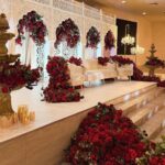
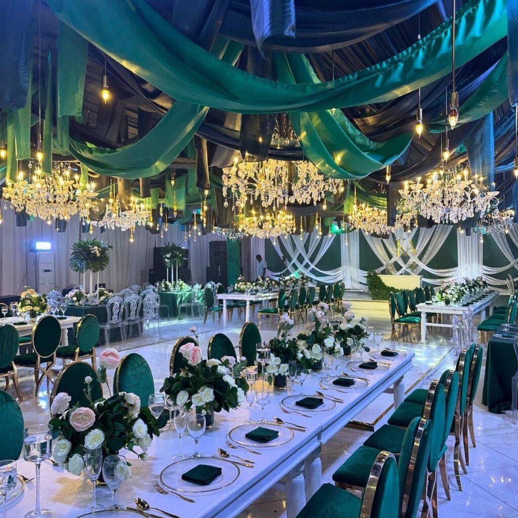
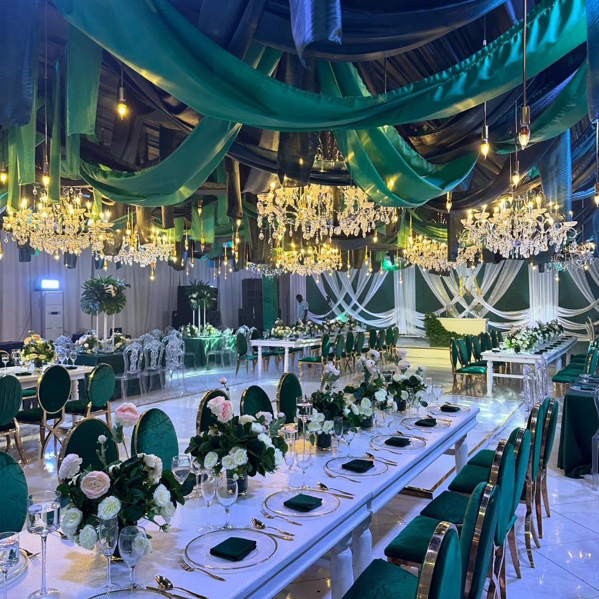
Draping it overhead, the way the ceiling fabric pools between chandeliers, turns the whole room into a jewel box; the velvet chairs echo it rather than compete.
Gold is the natural partner here, not silver.
Warm metallics keep the tone rich instead of cool. White tableware lets the green and gold carry the whole look without fighting for attention.
This palette asks for a venue with some architecture already worth highlighting.
In a plain ballroom the drapes do more heavy lifting, which means more fabric and more of your budget heading toward rental. A space with existing moldings or tall windows gets you farther for less.
2. Lavender, Deep Green, and Gold Garden Wedding
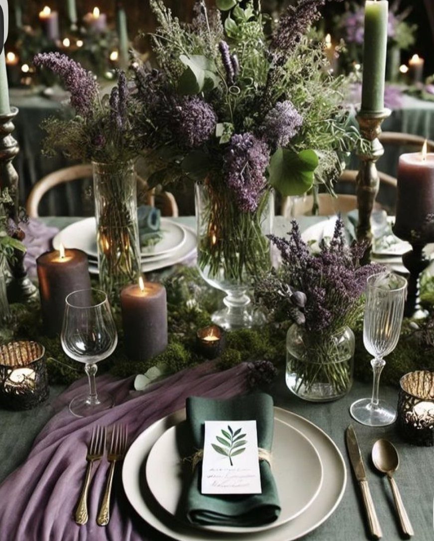
Garden weddings give you permission to let the setting bleed into the design. Deep green linens ground the table while lavender and moss pull colors from what grows outside; gold flatware catches light the way afternoon sun hits leaves.
Keep the purple deep enough that it reads as garden color, not frosting.
Choose a muted, dusty lavender over anything bright or pastel, and let the green stay forest-dark rather than sage. Moss and candlelight add the texture that saves this from looking like a staged tea party.
I would use this for a late summer or early fall garden, when the outside greenery has deepened but not browned. Spring’s too-pale light fights the depth of these tones.
3. Beach Wedding Colors
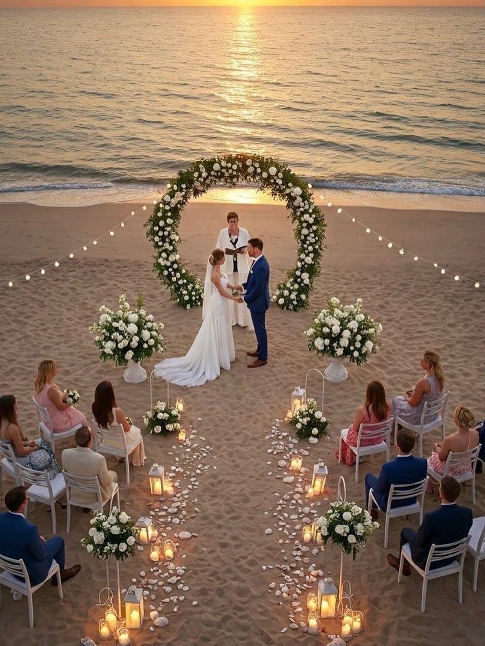
Beach ceremonies have one built-in advantage: the backdrop does half the color work for you. Your job is not to compete with the water and sand but to nod at them.
Light blues and sandy neutrals keep the feeling calm, the way the ocean reads at sunset.
Corals or seafoam greens add interest without breaking the calm. If you want more punch, turquoise against the actual water holds up better than emerald, which can look muddy in bright salt light.
Wind and sand are the price you pay for the light.
Loose fabrics, tall centerpieces, and anything paper need securing or abandoning. Lanterns and low arrangements, the kind that sit steady on the ground, survive better than elevated designs.
4. Pale Blue and Green Wedding Colors
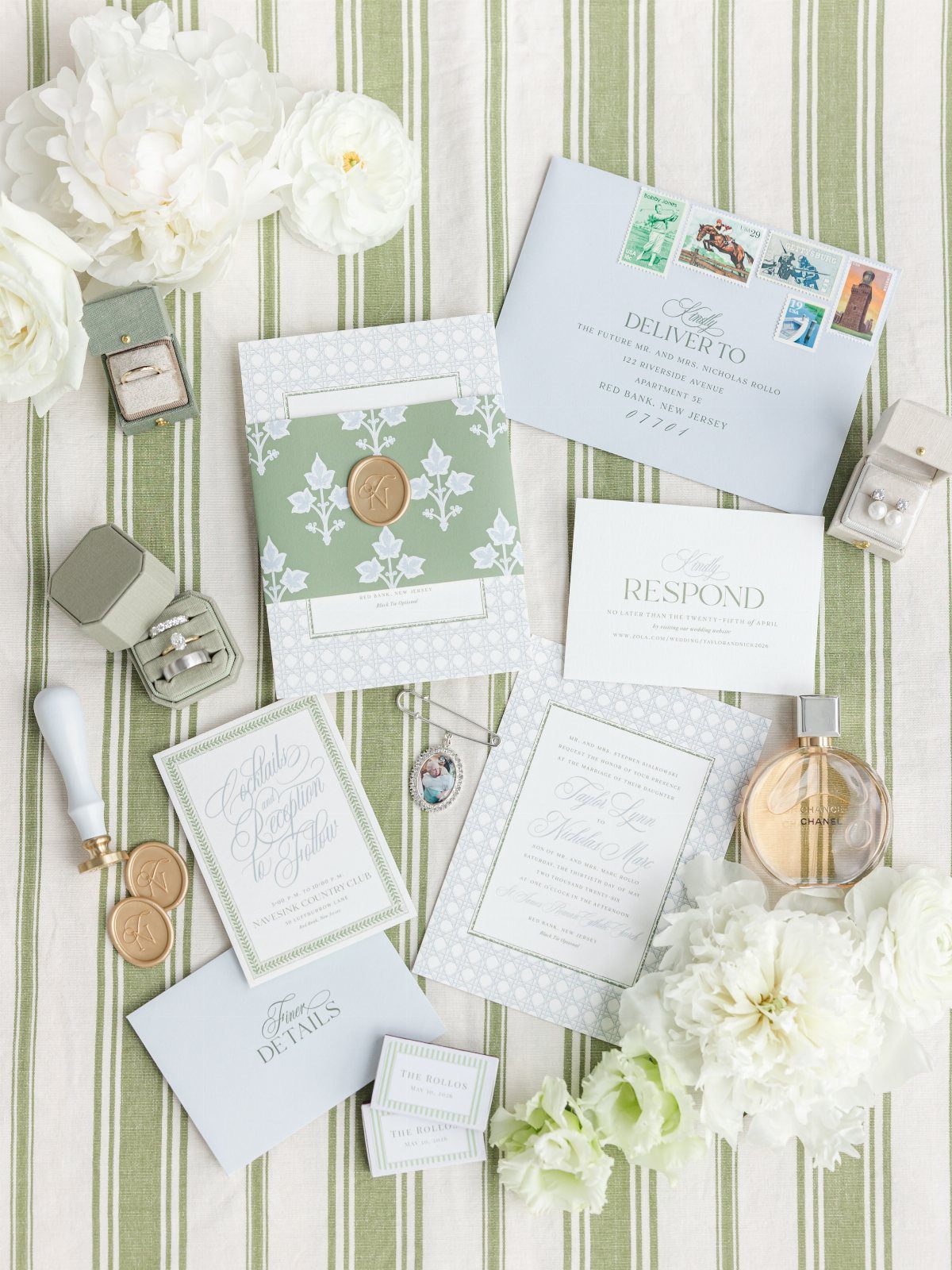
Pale blue and green read as cool and ordered, which suits couples who want elegance without formality. Striped fabric grounds the flat lay, the sage ring box and blue envelopes repeat at different values, nothing shouts.
I would carry this through to bridesmaid dresses in the blue, table linens in the green, and keep the flowers white or cream.
The palette needs one warm note, the way the wax seal or perfume bottle adds amber, or it risks feeling clinical.
This combination works across seasons but changes weight: deeper values for fall, lighter for spring. The photo’s summer-bright version sits in the middle.
5. Pastel Wedding Colors
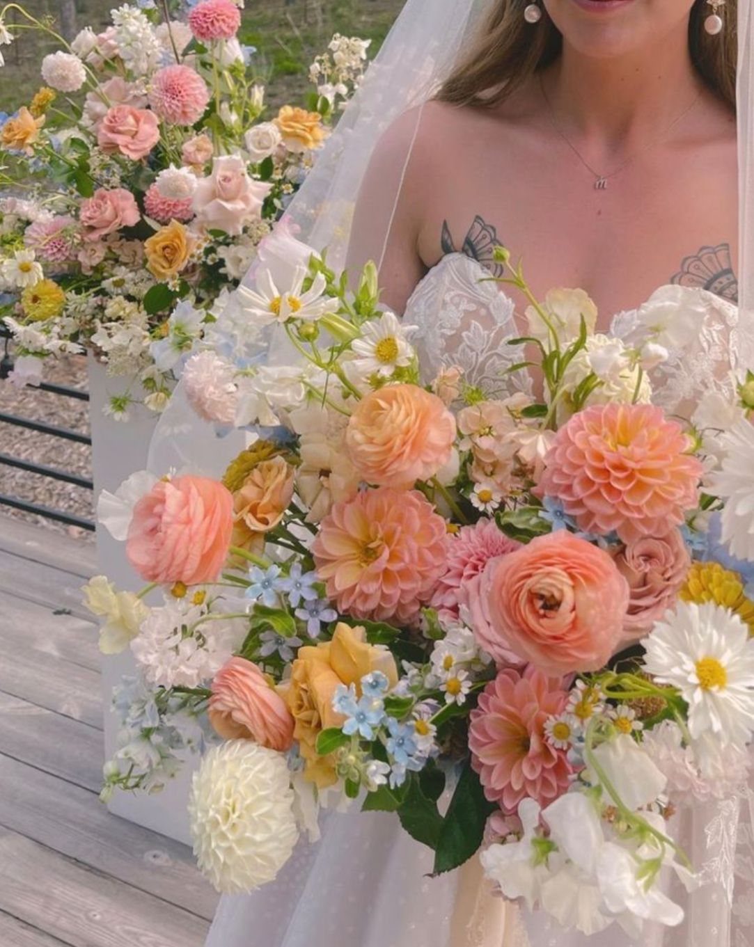
Pastels succeed when you layer enough of them that no single color dominates. Blush, lavender, mint, peach, and powder blue together, the way the bouquet shows, create a hazy field rather than a pointed statement.
The risk is infantilism.
I would avoid anything too perfectly matched, too round-edged, too much like a nursery. Slightly wild, slightly overfull flowers, with stems and leaves showing, keep the color from going flat.
Gold accents add warmth and a suggestion of structure, as they do in cake details and dress hardware. Without metal or wood, pastels can feel like they might float away.
6. Rose Gold Wedding Colors
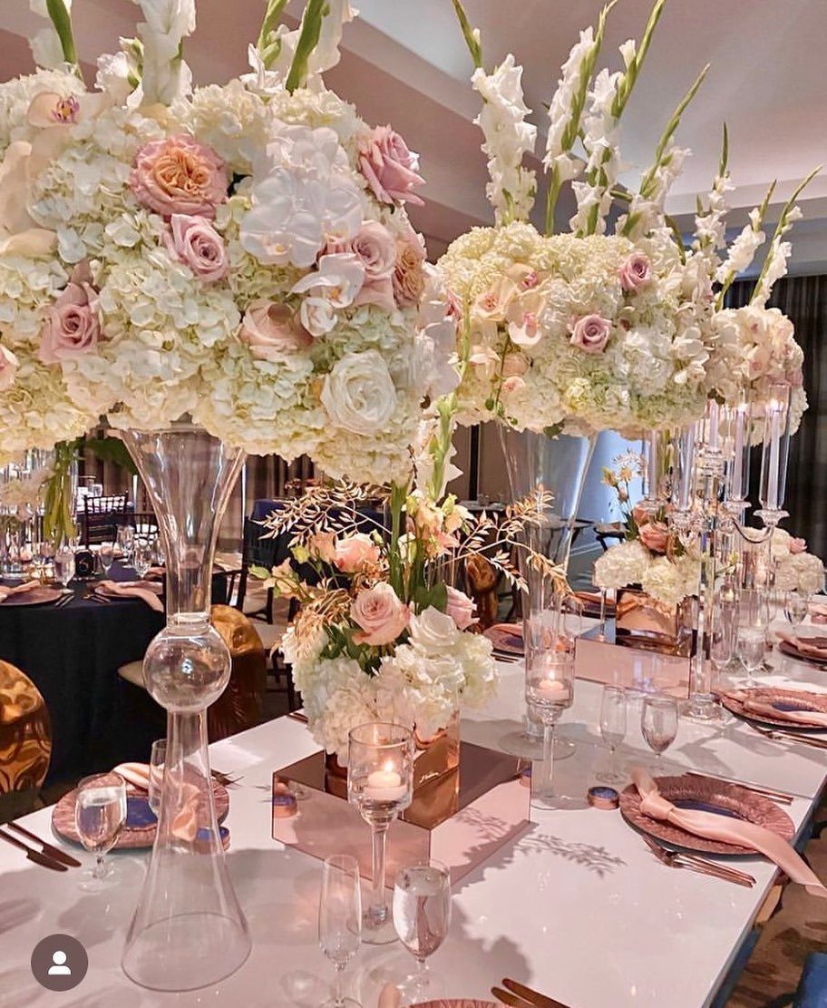
Rose gold has the unusual quality of reading modern and warm at the same time. Mirrored pedestals bounce candlelight, charger plates add metallic weight, and blush flowers soften what could otherwise turn hard.
I would use this for an evening reception.
The metallic elements need dim light to perform; in afternoon sun they look thin and pinkish rather than glowing. Soft greenery works best kept minimal, letting the metallics and blush work without competition.
The palette does ask for some investment in the reflective pieces, the pedestals and chargers, to carry it off. Without them, rose gold in fabric or paper alone can read as coppery or dated.
7. Wildflower Wedding Colors
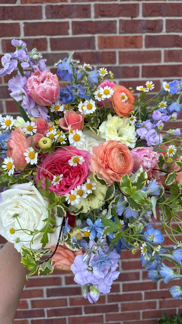
Wildflower palettes borrow from meadows rather than flower shops: chamomile, delphinium, ranunculus, and daisies mix without strict matching because they grow that way.
Keep stems visible and arrangements slightly loose, the way a brick wall backdrop lets them read as picked rather than arranged.
Too tidy and the colors read as clash; wild enough and they read as abundance. Sage foliage ties the brights together.
I would use this for a late summer wedding, when local blooms are at their height and you can source from growers rather than flown-in imports. That cuts cost and keeps the stems sturdier in August heat.
8. Blush Wedding Colors
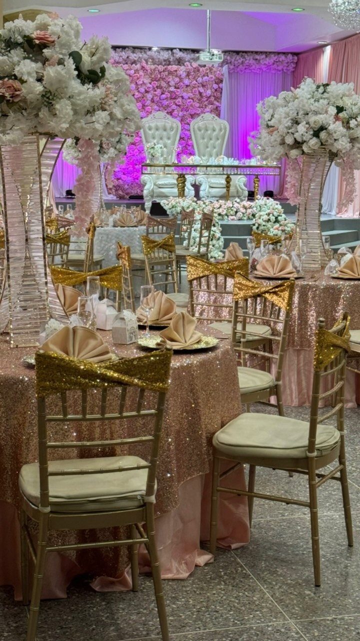
Blush sequins on tablecloths read celebratory rather than sweet, especially under reception lighting where flat pink would flatten. The texture does the work of a second color.
Pairing it with sage, the way the place settings show, keeps the romance soft without drifting into too-sweet territory.
Gold chairs add warmth; white flowers keep the centerpieces from competing with the cloth. I would carry navy into groomsmen attire and let the bridesmaids wear the blush, so the couple’s party echoes the room.
The sequined cloths run higher in rental cost than standard linens. A budget fix is blush satin with sequined runners, concentrating the sparkle where photographs catch it.
9. Navy and Terracotta Wedding Colors
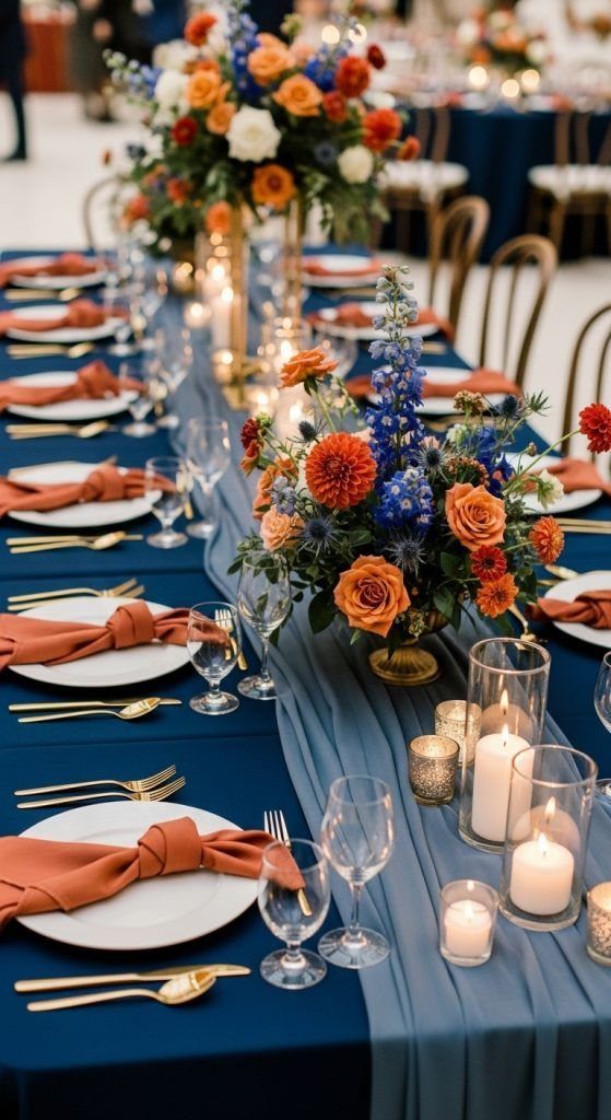
Navy and terracotta sit at opposite temperatures, which keeps a long table from going flat. The knotted napkin shape adds texture without extra rental; the dusty blue runner softens the jump between dark linen and bright flower.
Gold flatware is the right metal here.
Silver would chill the terracotta, and rose gold would fight it. The orange roses need to stay saturated; pale peach disappears against the warm napkin.
Check your venue’s candle rules before counting on the glow implied. Navy linen drinks light, and a no-open-flame policy leaves the table darker than candles would have allowed.
10. Champagne and Black Wedding Colors
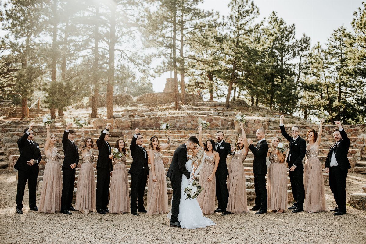
Champagne bridesmaid dresses against black suits photograph as a single warm shape, which is why this pairing works for large wedding parties where individual faces risk getting lost.
Forest and stone backdrops help; in a plain ballroom the same colors can look like a rental catalog spread.
I would add greenery rather than blush flowers for the bridesmaids to carry.
Pink next to champagne tends toward peach in outdoor light, which narrows the dress color’s flexibility. White or cream bouquets keep the contrast clean.
The groomsmen’s black should be true black, not charcoal.
11. Gold and Peach Sunset Setting
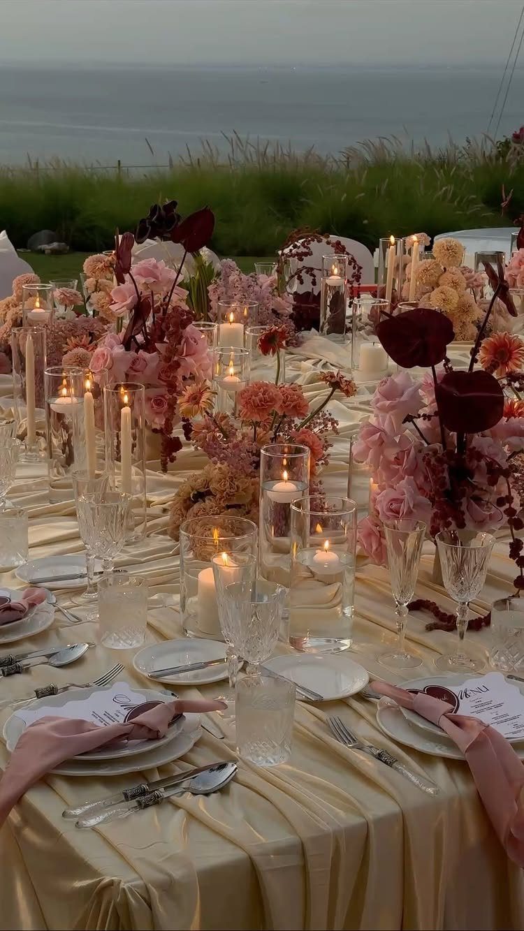
Gold linen catches sunset light the way matte cloth cannot, which matters when your reception table faces open water. Draped fabric can do structural work, creating a canopy effect without a tent.
Candlelight is not decorative here; it is necessary.
By dusk the sea goes dark and the table needs its own source of warmth. Mix floating candles with pillars at staggered heights, and keep centerpieces low enough that guests can see across.
This setup trades wind stability for the view. Weights under cloth edges and hurricane glass around flames are practical requirements, not optional additions.
12. Citrus and Mediterranean Blue Palette
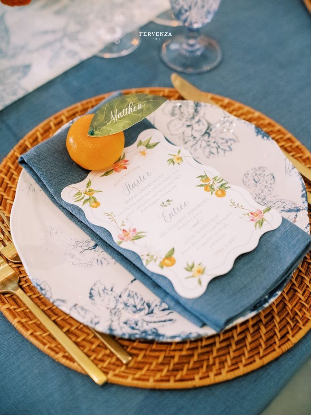
A single orange with its leaf, used as a place card holder, does more to establish a palette than printed stationery alone. The woven charger and patterned blue plate layer 3 textures before the food arrives.
The Mediterranean reference holds only if you commit to the blue as a strong rather than pastel value. Dusty blue, the way some Southern garden palettes use it, goes cottage; this depth of cobalt goes coast.
Fresh citrus as decor lasts the evening but not the week. Source it close to the event, and count on some fruit needing replacement from handling during setup.
13. Rustic White and Wood Palette
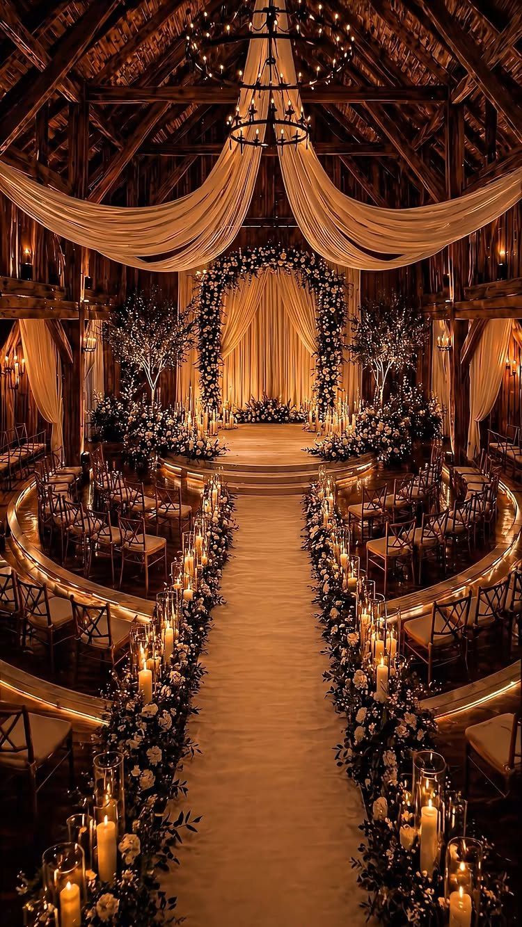
Raw wood frames white so the contrast does the decorating. Curved seating and draped fabric soften a barn’s structure without hiding it, and hurricane candles carry light where ceiling fixtures cannot reach.
I would keep the white in flowers and fabric rather than painted wood.
Paint fights the grain; bare timber or stain lets the architecture read as found, not dressed up. The floral runners need water sources hidden in the runner itself or they wilt before the ceremony ends.
Check whether your barn allows open flame. Glass hurricanes solve this for candles, but fabric drapes near heat need clearance or flameless substitutes.
14. Classic White and Greenery Tablescape
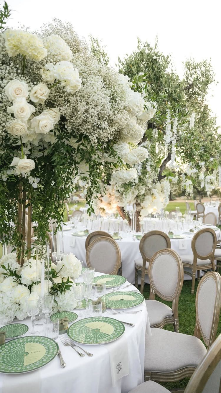
White linens and green plates build a table that reads formal outdoors because the structure is strict: round tables, uniform chairs, towers of rose and baby’s breath repeating at measured intervals.
The green plates carry pattern that would busy a smaller table.
At this scale, the eye reads them as texture rather than motif. I would keep the chairs simple; ornate ones compete with the centerpiece height.
Outdoor grass means uneven ground.
Table stabilizers or weight on bases prevent the towers from listing, and a backup tent plan matters more than the forecast promises. The white flowers photograph cleanest in open shade; direct sun blows out petal detail and greens go yellow.
Frequently Asked Questions
What are some good color schemes for a wedding theme?
Good schemes start with where you are getting married and when. A historic ballroom already dressed in molding and chandeliers asks for emerald and gold, while pale blue and sage green keep things graceful without turning stiff.
Late August through September is when wildflower palettes make sense, because that is when the flowers are actually there. The venue’s light and the season’s natural colors do half the work if you let them.
What are the trendy wedding theme colors for 2026?
The palettes I see couples using now lean toward muted depth rather than brightness: butter yellow, black cherry, dusty blue, warm chocolate, muted lilac, soft apricot, and mineral green.
These carry enough saturation to photograph well without the harshness that dated the bolder trends of a few years back.
Fall weddings still pull from burnt orange and deep red; winter ceremonies are adding soft pink or heather purple as accents rather than main colors.
What are the top wedding themes?
Garden weddings want colors that belong outside; beach ceremonies need tones that hold up against sand and open sky.
Rustic barn celebrations and formal outdoor receptions each follow their own logic, and the palette has to match the place before anything else.
Garden designs pull from what grows outside; beach palettes nod to sand and water rather than competing; rustic themes keep wood bare and white in fabric rather than paint.
What unifies them is that the setting drives the choice, not the other way around.