Blue wedding decor can be as simple as a candle favor or as involved as drapery that restructures a whole room, and the right choice depends less on budget than on whether your venue is indoor or out.
Powder blue parasols work as guest sun protection and ceremony color until the service starts, then become keepsakes; the same fabric hung indoors behind the couple reads as sky.
1. Blue Wedding Bouquet
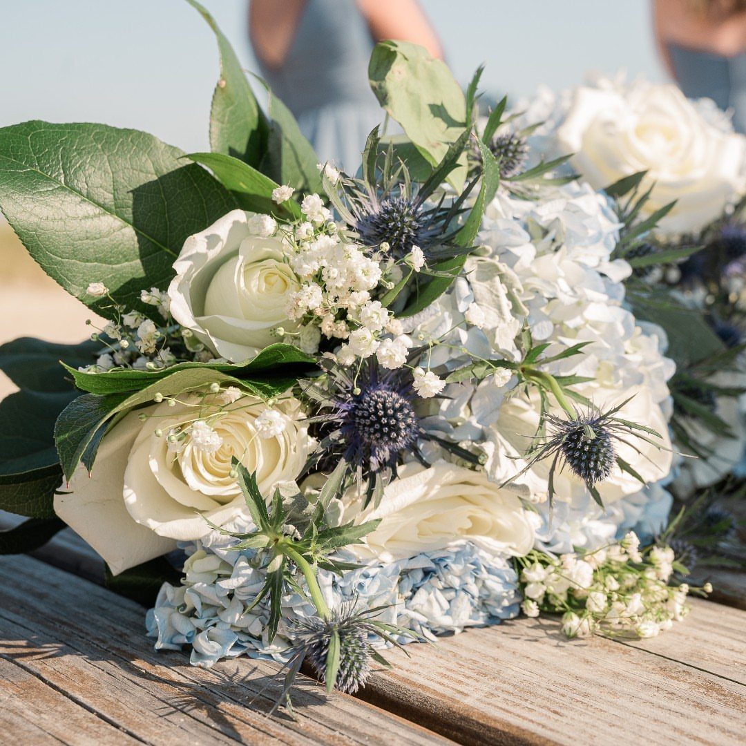
Fresh blue flowers against white roses give a bouquet that reads as garden-picked rather than florist-arranged.
Hydrangeas run fuller and softer than delphiniums, which spike vertical and suit a taller bride or a more formal gown; either pairs well with baby’s breath and minimal greenery for airiness.
I like sea holly thistles for texture, though they scratch against bare arms during portraits if the stems sit too low.
Keep the handle wrapped in ribbon that matches your bridesmaids’ dresses, since the palette in your hands ties to the line behind you in nearly every photo.
2. Blue Wedding Table Decorations
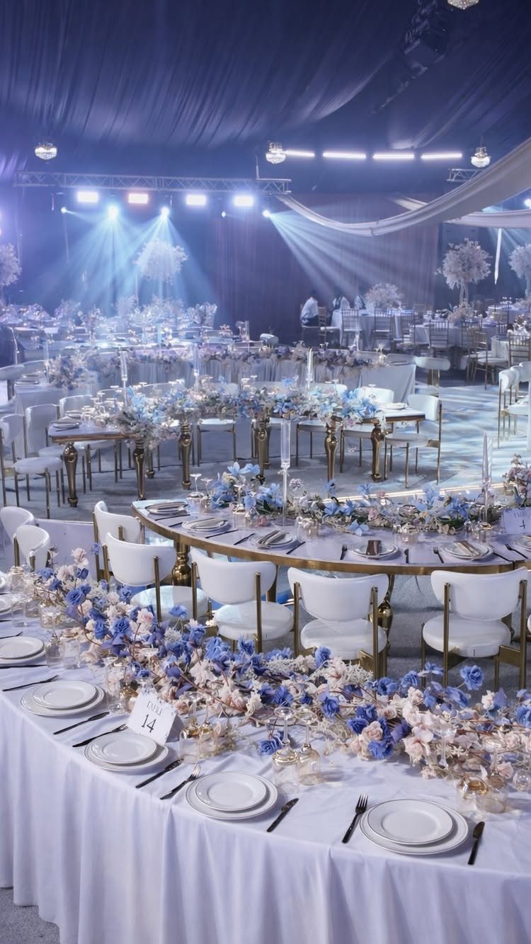
Blue reception lighting turns ordinary banquet halls into something else entirely, though it needs actual flowers to keep from reading as corporate event.
Floral runners in blue tones read softer than full tablecloths; pair them with clear glassware rather than tinted, since blue-on-blue washes out plate detail.
I have seen hosts use powder blue napkins folded over gold chargers to break up the color mass, and the contrast holds up better in photos than all-blue settings.
Floral runners with blush as relief keep a blue tablescape from turning cold once the sun goes down.
3. Blue Wedding Cake
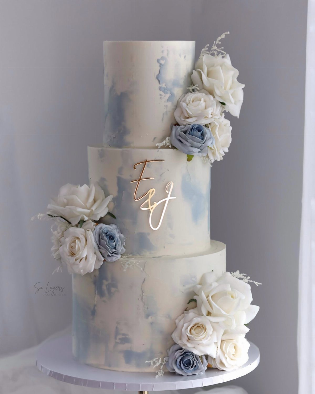
Watercolor frosting in pale blue lets a white cake read as themed without committing to solid color, which can look like a baby shower if the tone slips even slightly.
The marbled technique here hides uneven application; that matters if your baker is working in summer heat. Fresh roses in dusty blue and white sit better than fondant flowers, which crack fast once they leave the refrigerator.
I would ask for the monogram in gold rather than silver; it photographs warmer against the cool tones. Fondant gives the smoothest base for watercolor work, though buttercream tastes better and runs more risk.
4. Elegant Blue Wedding Shoes
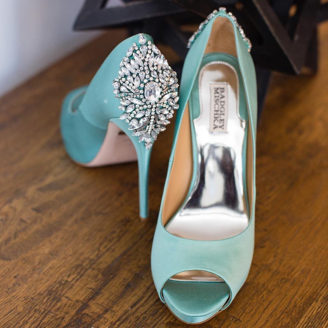
Satin in light blue or mint catches light the way white satin does, which means every flash photograph picks up the shoe.
The crystal heel here is substantial enough to balance a full skirt; a slimmer heel disappears under tulle and leaves you looking footless from certain angles.
Peep-toe shapes work with shorter hems or changes into reception dresses, not with floor-length ceremony gowns where the shoe hides entirely.
I have seen brides choose a bolder cobalt for the same reason; pastel reads as accidental in small glimpses, while saturated color looks intentional.
Break these in on carpet, not hardwood, since satin scuffs show as light marks against dark blue.
5. Powder Blue Wedding Decor
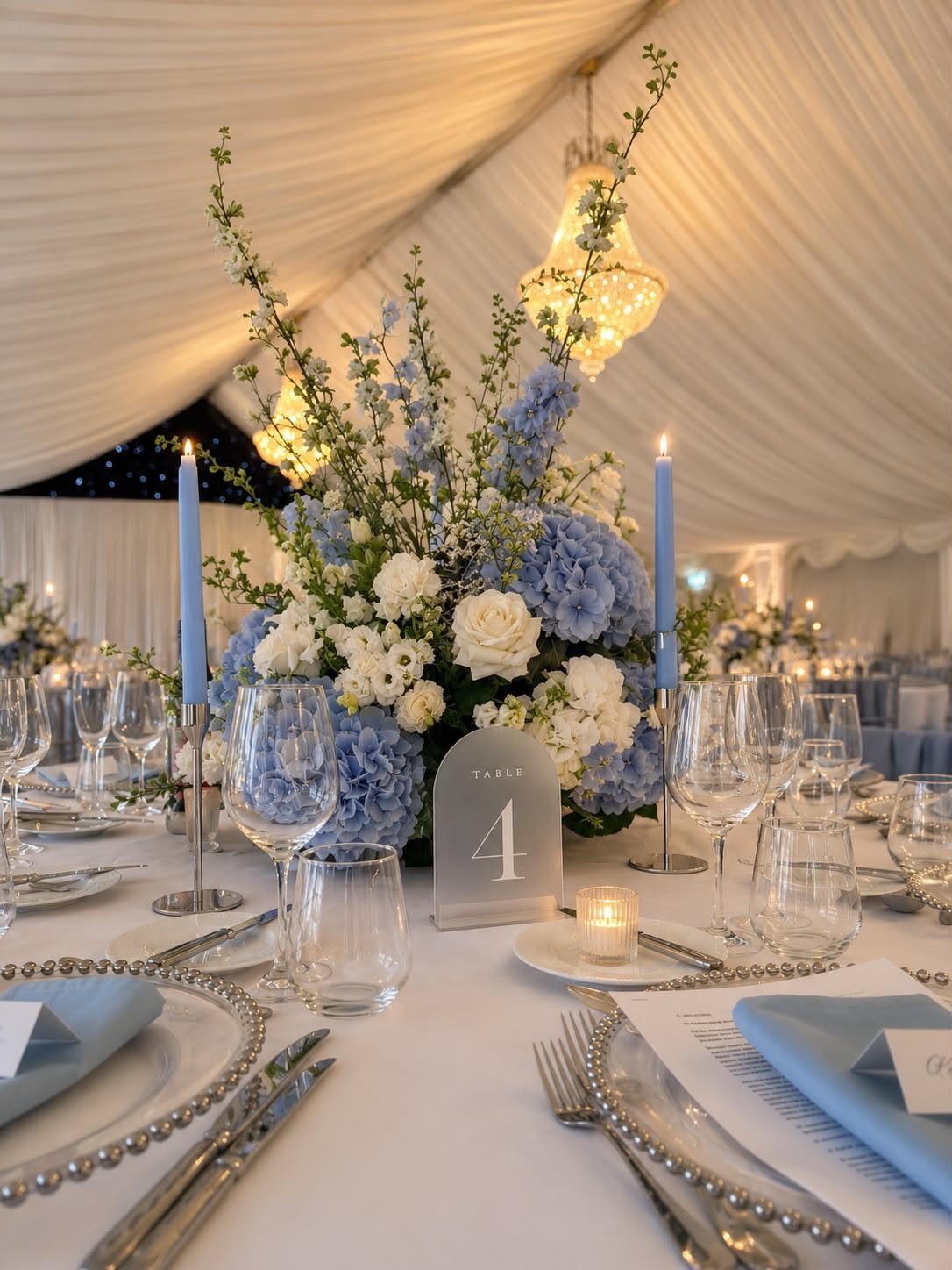
Powder blue reads as color without announcing itself, which suits couples who want serenity rather than statement. Standard white candles dipped in powder blue wax cost little more than plain and burn the same hours.
I would keep the napkins in the same tone as the flowers rather than matching the candles exactly, since too many identical blues flatten the table into one plane.
Chiffon drapery overhead, if your tent allows it, continues the fabric story without adding more objects. An arch table sign in painted wood has its place, though acrylic in the same shape reads more modern and survives outdoor humidity.
6. Dusty Blue Wedding Invitations
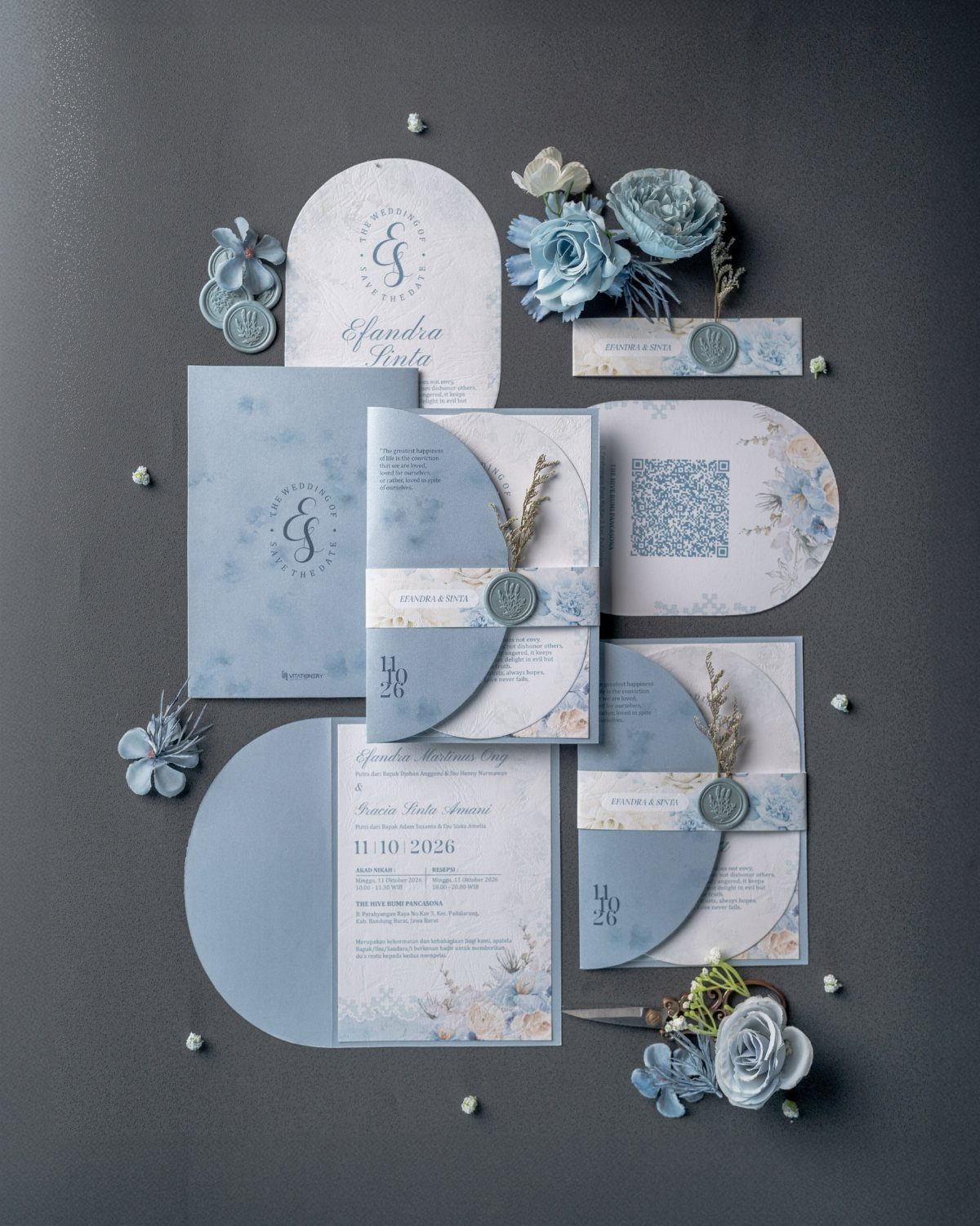
Dusty blue paper stock sets a mood before the envelope is opened, though it needs off-white or cream ink to stay legible; pure white disappears against the muted tone.
Deckled edges, as in this suite, catch light and feel handmade, but they fray in USPS sorting machines; hand-cancel at the post office or use inner envelopes.
Wax seals add weight and postage cost; I would skip them for save-the-dates and reserve them for the invitation itself. Floral patterns printed rather than embossed keep per-card cost down for larger guest lists.
Faux silk flowers in the styling photograph suggest the palette; your guests see only the paper, so match the ink to your actual florals, not to the prop flowers.
7. Blue Wedding Favors
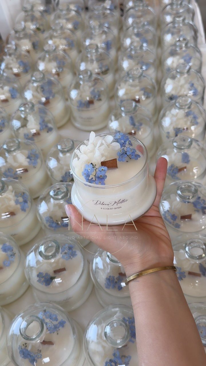
Small candles in blue wax give guests something they will actually use, unlike Jordan almonds or miniature picture frames.
Dried flowers pressed to the glass and a wood wick that crackles give these candles a second life on a bathroom shelf long after the night ends.
Custom labels in white ink on blue paper cost more than plain tags but tie the favor to the table decor; I would order a few extra since these roll off transport carts and get claimed by early guests.
Glass cloches protect the candle and turn the favor into its own place setting decoration, though they double the per-person cost and require assembly the morning of.
For a simpler version, powder blue tissue paper around a votive in a kraft box closes with a wax seal in the same shade. Skip scented candles if your menu is heavy on herbs or flowers; competing smells dull both.
8. Blue Wedding Ceremony Decor
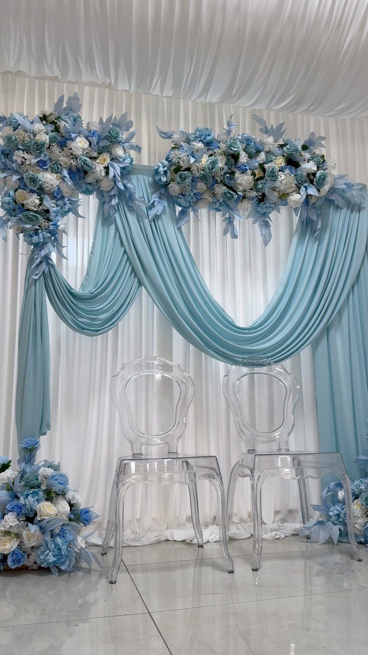
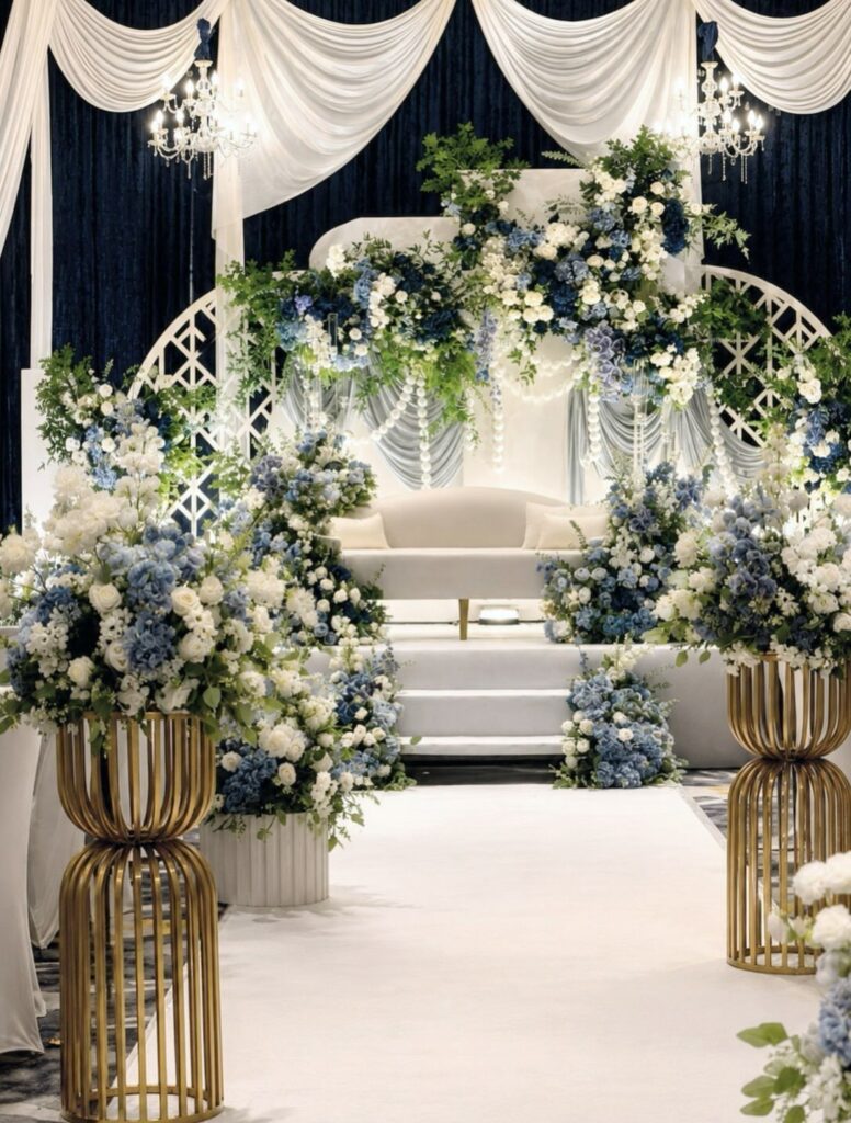
Powder blue drapery behind the couple, as in this setup, reads as sky rather than curtain; chiffon catches outdoor light and linencatches indoor.
Floral arrangements at the top and base of a draped panel frame the couple straight on for guests seated head-on and give side guests something to look at besides profiles.
Clear acrylic chairs keep the eye moving through to the fabric rather than stopping at dark wood or white resin.
A unity ceremony with blue sand layers into a single vessel; the color stands for stability, though the metaphor works better if both partners pour.
I have seen outdoor hosts use powder blue parasols for guests, which serve as sun protection and decor until the ceremony starts, then become favors.
Indoor ceremonies benefit more from the draped backdrop, since wind turns parasols inside out and ties up ushers.
9. Dusty Blue Table Linens
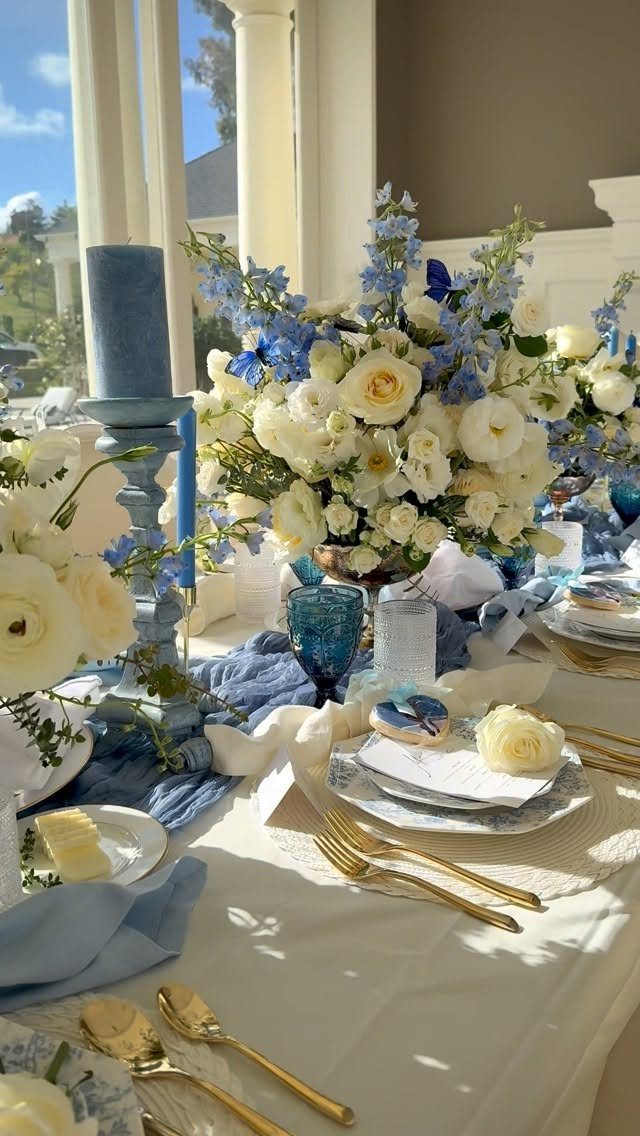
Crinkled fabric in dusty blue, as here, hides the wrinkles that smooth linen shows under reception lighting; the texture reads as intentional rather than unpressed.
A runner that stops short of the table ends leaves room for elbows and centerpieces without crowding; a full cloth to the floor costs more and requires steaming.
Gold flatware against the cool tone warms the setting, and the blue glassware repeats the runner color at each place without matching exactly.
Low centerpieces in white and blue, as visible, keep sight lines open across the table; the floral here sits in a vessel hidden by blooms so nothing blocks the conversation.
For a beach or garden wedding, this palette suits the setting without competing with it; in a ballroom, add candlelight to keep the cool color from turning cold once the sun sets.
Creating a Cohesive Theme
Powder blue needs a quiet partner or it fades into white under flash photography.
Ivory and cream give it something to push against without starting a fight for attention; beige or light gray work the same way if your venue already carries warm wood tones.
Table linens and drapery carry the color well, but bridesmaid dresses and ribbon wraps on the bouquet handle are where most couples lose the thread.
Match the dress tone to the flower ribbon, not to the candles or napkins, since the eye reads those 2 elements together in nearly every formal portrait.
Blush and dusty rose sit well against powder blue if you need depth, though pale lavender can turn muddy under tungsten reception bulbs.
One rule I follow: pick the neutral base first, then the blue, then one accent at most. 3 colors is enough; more layers dilute the calm the palette is meant to create.
Using Lighting Effectively
String lights and candles do different work for blue decor than they do for warmer palettes.
Blue reflects cool light, so amber candle flames warm it without clashing; pure white LED strings keep the chill intact, which suits a summer garden but can feel clinical in a January ballroom.
Uplighting in pale blue is a risk I would skip, since it competes with the fabric color rather than revealing it. Chandeliers with real bulbs, dimmed low, give enough glow for dinner without flattening the tablescape detail.
For the ceremony, late afternoon natural light through sheer panels does what no fixture can replicate. If your timeline runs into dusk, plan the transition: candles lit before the last outdoor light fades, so neither source is lonely.
Incorporating Textures
Velvet and lace read as luxury against the flatness of powder blue satin or chiffon, but they need to earn their place.
A velvet cushion on a ceremony bench is felt once and photographed; a velvet table runner is touched and seen for hours.
I would choose one velvet element, not both, since the texture is heavy and can overtake the color. Lace works lighter as a patterned overlay on the tablecloth, or as the detail on a cake tier.
Crystal glassware catches light the way the crystal heels do, though too much sparkle next to blue can turn ice-cold. Gold-rimmed glasses add warmth that raw crystal does not.
Silver cutlery against dusty blue linen is correct in theory; in practice it can read as hotel banquet unless the flatware has some weight or pattern to it. If your venue supplies standard stainless, gold is the safer rental upgrade.
Choosing Complementary Colors
Navy is the obvious contrast to powder blue, and the obvious is not always wrong. A navy suit on the groom, with powder blue ties for the party, gives the photographs a vertical anchor that pale tones alone cannot.
But navy can swallow powder blue if they share too much surface area; keep the dark color to clothing and small accents, not to tablecloths or drapery. Blush is the softer choice in floral runners.
Dusty rose is the deeper, dustier cousin of blush; use it where you need more saturation than blush provides, as in the bridesmaid bouquets or the invitation envelope liners. Pale lavender is the riskiest pairing.
It works on paper and in flat-lay photographs; under mixed reception lighting it can separate into purple and gray, neither of which serves the blue. Test it in the actual venue before committing.
Frequently Asked Questions
Why choose powder blue for your wedding decor?
Powder blue settles into a room like quiet air, present enough to feel but never loud enough to compete with the people in it.
It carries a calm that works against ivory, cream, or warm wood tones without fighting for attention.
The shade photographs well if you give it a quiet partner to push against, though it can fade toward white under flash if left alone.
How do you create an elegant powder blue atmosphere?
Start with soft textures like chiffon drapery or crinkled table linens, which hide wrinkles and read as intentional under reception lighting.
Add warmth through amber candle flames or gold accents, since blue reflects cool light and can turn clinical without them.
One velvet element, lace as a table overlay, and crystal or gold-rimmed glassware give enough variety without the palette turning heavy.